This week, I got to get more familiar with the adjustment bar on photoshop. I got to experiment withe contrast/brightness, exposure, colour balance and channel mixer. At first it was challenging to figure out the purposes of each tool, but as I got more familiar with it, I could manipulate them to bring out the effects I wanted.
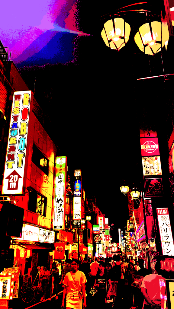
Below, on the left is a picture I took of a busy street in Tokyo and decided to edit it. I wanted to give it a comic-like effect. In order to bring out this effect, I mainly worked with the channel mixer and the colour balance tool. I put a lot of warm colours in it by adjusting the channel mixer, and putting the red level at +100, the green at +109 and the blue at +90. I also adjusted the brightness/contrast to bring out the lights and the bright colours in the image by using the wand tool.

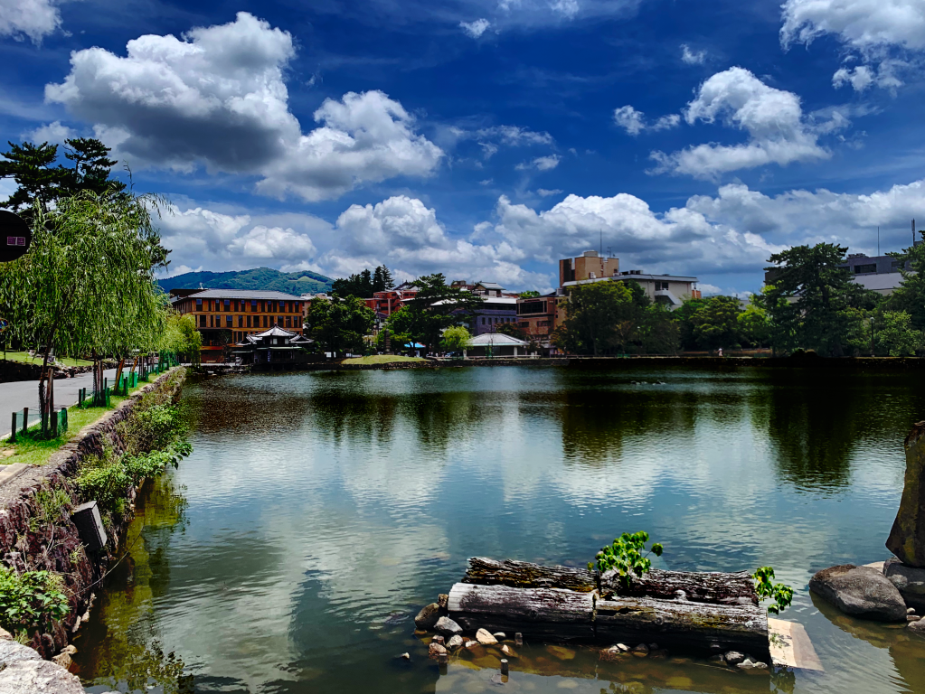
While editing this image, I got a better understanding of why artists and photographers edit their images in the first place — to make certain aspects of the picture stand out and evoke a mood. The picture of the left looks dull, and doesn’t have much colour in it. I learned how to manipulate the curves tool in the adjustment bar, increasing the levels of contrast, shifting the colours, saturating parts of the picture and creating shadows by darkening certain parts. The picture on the right, I think shows more detail and has more colour in it too. This makes the image look more serene and appealing to look at, too.

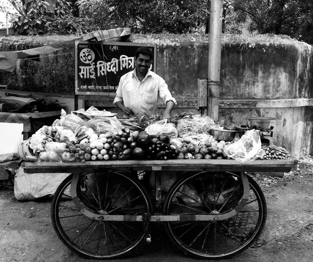
I picked a black and white image that I took of a hawker and decided to add colour to it from scratch. The colour balance tool helped immensely in this process. I got to use this tool bar, change the levels and colours in order to give colour to the vegetables on the cart.