
In the thirteenth week of our classes, I got to tie up my illustrations with a common thread. I noticed that my previous book covers were all over the place, although they did explore different genres, they did not have a common quotient such as a common title or a common genre. This would give my designs some order and discipline, making more sense to me and my viewers. I decided to narrow down my genres to: Fantasy, mystery, classic, young adult contemporary and a children’s book cover. I chose two illustrations I did last time which adhered to the theme of my covers and matched the title too. I did this on purpose because I was satisfied with the illustrations and the outcome for those two and chose to finalise it in my iterations.
Below are the completed iterations:

Mystery 
Fantasy 
Classic 
Children’s book 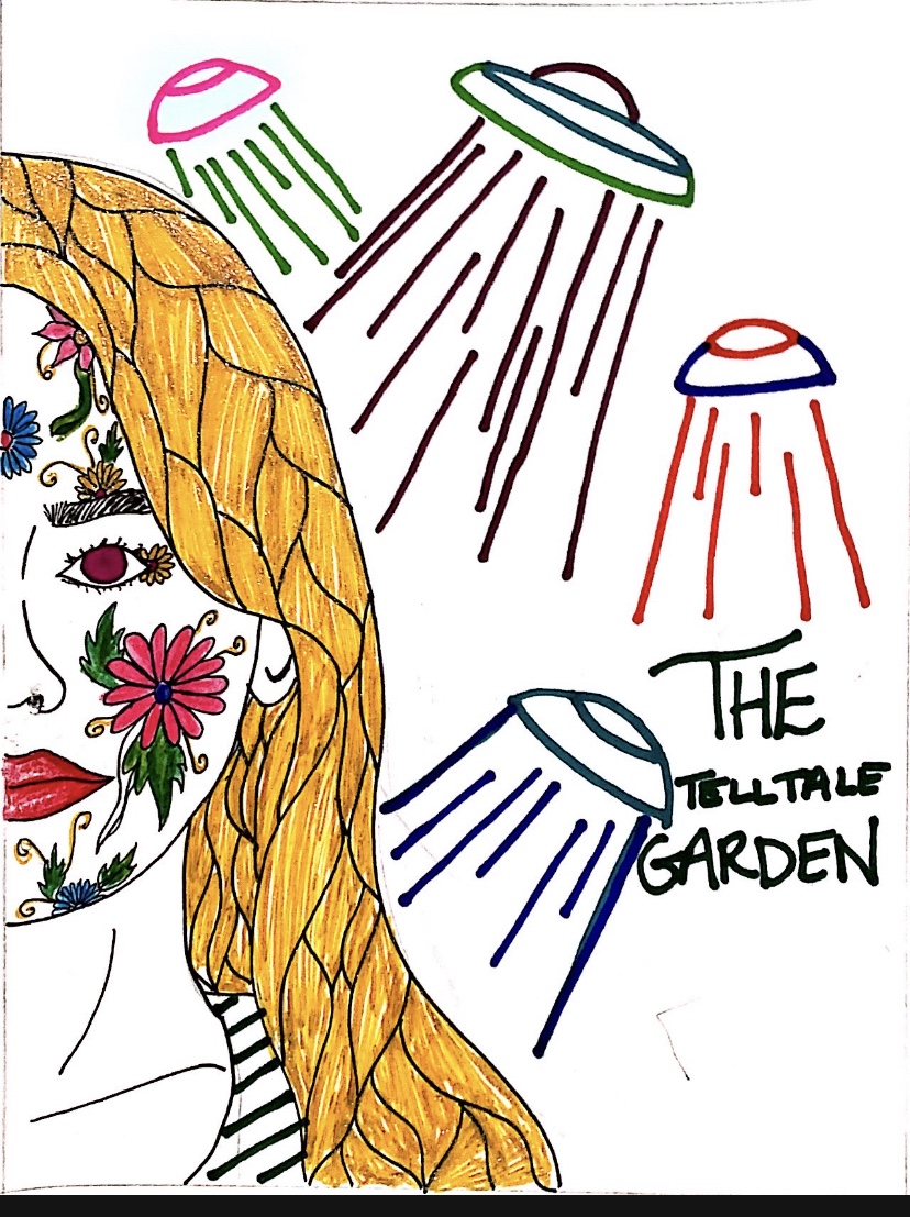
science fiction
After creating these iterations I realised how important it is to have a common thread among themes. Like for example “lord of the Rings” could be portrayed only as an adventure book or also as a romance novel, it all depends on how you execute it and illustrate it. I learned the importance of illustrations and how significant they are in order to communicate ideas and messages. This makes them powerful and therefore very crucial when it comes to any type of field work whether its interior, graphic or fashion design. I plan on settling on my iteration of “Fantasy” as this is a very interactive and complex genre which can have several elements to it. I also want to specifically experiment with colour in order to convey ideas which is heavily used in this particular iteration.
