
Week 1 | 30th July, 2019 | Prasad Joshi
Rasters Vs Vectors
In the first Imaging class we contrasted rasters and vectors by teaming up and researching each one’s weaknesses and strengths.
Raster graphics consist of pixels, which are the smallest addressable elements on a screen. Most pictures we see on screen are raster images, such as GIFs, Jpegs, and PNGs. They make up movies, TV shows and photographs. The more detailed an image, the larger the file capacity. The resolution of these images is expressed in terms of the number of pixels in a column times the number of pixels in the row. For instance: 1920 x 1080 px.
Vector Graphics, however, consist of paths and lines, instead, and can be maximised and minimised upto 20% with the quality of the image still in check. They are constructed with mathematical formulae instead of pixels and can be used for graphics that require resizing. Vector graphics are used in PDFs, AIs, and EPS.
Adobe Illustrator Software
In the first imaging session we also learned the very basics of the Adobe Illustrator software. We explored what each tool in the tool bar can depict on the art board. We also learned shortcuts to access the tools. Such as “V” for the Selection tool, “A” for the direct selection tool, “P” for the pen tool, etc.
Week 2 | August 6th, 2019 | Prasad Joshi
In the second week of imaging classes, we were taught of the Gestalt principles. Gestalt principles are a set of principles in psychology and in art that explore how humans perceive patterns and designs in compositions. There are six different gestalt principles:
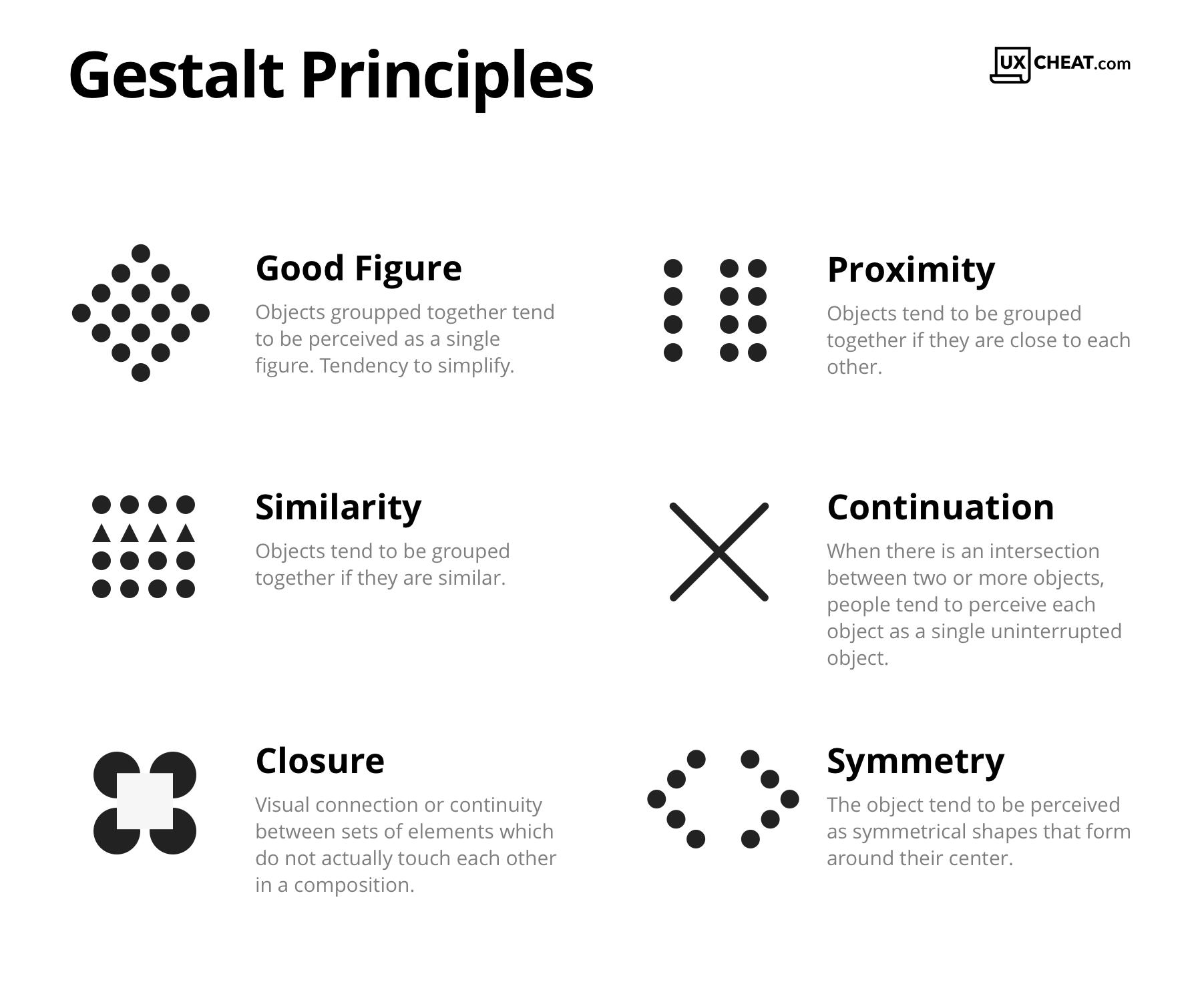
These principles in psychology overlap with with art. Humans have an inherent way of classifying patterns, objects, forms and figures without even realising it. These principles help artist convey ideas and make art and designs.
Homework:
We were told to explore Adobe Illustrator by creating a poster which explores at least one of the gestalt principles.
Week 3 | August 13th, 2019 | Prasad Joshi
In the third week of Imaging, we were told to present our posters, the ideas behind them, and the principles used to create them.
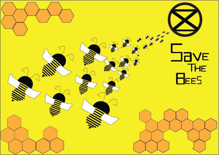
My Topic revolved around the idea of “Save the Bees”. Bees are under a huge extinction threat in the 21st century and it is important for us to save them, because they pollinate plants and create more vegetation for humans to survive. Without bees, there will be no humans. Therefore, I made a poster that revolved around the idea of bees slowly moving towards extinction to make the audience realise the severity of the situation.
Gestalt Principles:
The principles that I used were closure (in the body of the bees), continuity (with the bees are moving towards the extinction symbol), repetition (in the bees and the hexagons), and symmetry (in the body of the bees).
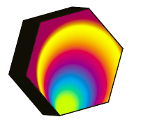
After presenting all of our posters, we were taught how to use the blend tool on Illustrator. I explored how it can be used to create several different designs and also took advantage of the colour wheel in the blend tool to create different effects. Below is a little bit of my experimentation:


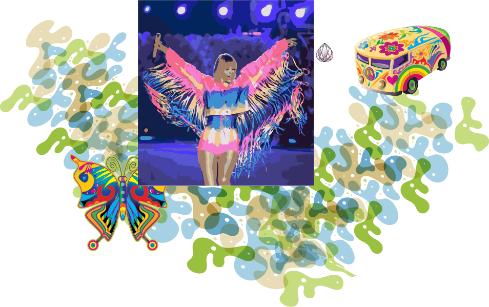
Using the skills we learned in this class and previous classes, we were told to create a poster of our choice with these tools. I chose to explore these tools by creating a music album poster for one of my favorite artists: Taylor Swift:

In the background, I learned how to use the gradient window to create different gradient effects. I chose to use pastel and neon colors because that is the theme of the artist’s next album. I used the blend tool for the “AUG 23” writing, the rest was created by using the pen tool.
At first, I struggled while using the pen tool. I forgot to close the paths and therefore it was too late for me to fill color in different parts of the drawing.
Week 4 | August 20th, 2019 | Prasad Joshi
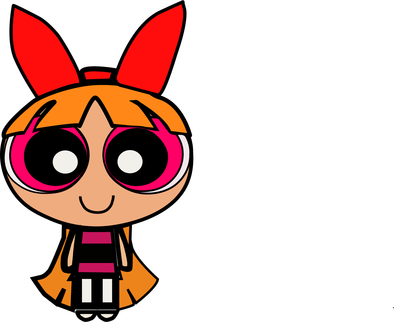
In week four of imaging we were introduced to more tools such as the image tracing tool, the clipping mask tool, the brush tool, ad the different symbols in our ilustrations. We were also taught how to make our own brush. This is how my exprimentation looked like in class:
I learned that the image tracing tool, can make things way easier for an artist to trace things, although the pen tool allows more control and dexterity.
Since I enjoyed creating my first cartoon character, I went home and created two more. I traced Ord from Dragon Tales and Princess Ariel from The Little Mermaid. Recently, Disney casted a black woman as Ariel, and a lot of people had a lot to say about it. Some showed support, some showed hate. I chose to support this amazing casting for Ariel and decided to create a modernised and a more representative version of the Disney princess Ariel.
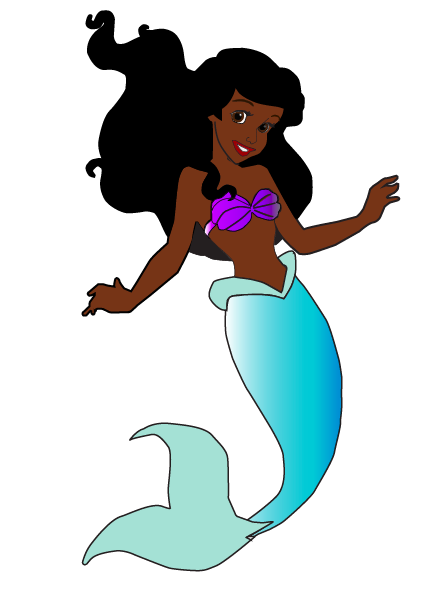

This time, I learned to close my paths, and make more layers to keep my illustration more organized, so that it’d be easier for me to fill in the body with colors. I am quite happy with how it turned out. I hope that in the future, when I learn more tools and get more accustomed to illustrator, I will be able to add more detail to my illustrations.
Later on, we learned how to use the clipping mask tool and create different effects. I chose to depict a different image that related to each word and painted a picture in the viewers mind.

As homework, we were told use the skills we learned in class today and create a third poster. I decided to create a movie poster for the upcoming Wonder Woman 2 movie.
Week 5 | 27th August, 2019 | Prasad Joshi
In order to put the tools we learned last class to use, (image trace, clipping mask and brush tool and text) I decided to make a movie poster on the upcoming Wonder Woman movie comping up next:

I found an image of the comic version of Wonder Woman online and image traced on illustrator, adding colours to the hair, body and face, the paint brush tool was also used to create the star in the background and the clipping mask tool for the text effect. The gestalt principles used in this poster were: closure and symmetry. The image trace tool made things quite easy to create, although using the pen tool would be more helpful to create accurate and precise depictions.
As we got to creating our fourth poster, we were told to incorporate all of the tools we had learned so far. This is the poster I made by the end of the class:

This poster was centred around the idea of women empowerment. The women in the middle are those who inspired me as a women to follow my dreams and be who I am – a designer. I tried to incorporate all the tools that we were taught thus far in class. The gestalt principles used in this poster were continuity, good figure, closure, and proximity.
Week 6 | 10th September, 2019 | Prasad Joshi
Today was our first day working with photoshop. We learned that the difference between photoshop and illustrator is that illustrator is based on vectors, whereas photoshop is based on pixels. Therefore, photoshop is used more when editing images and to create raster based artwork. Illustrator, however, is used more for creating logos, designs and graphics, instead.
When photoshop was first introduced, it was a little difficult to work with it because there was some difference between the tools, certain settings and functions. It was more varied and vast. However, once we delved into, I could easily work my way around it and figure it out. We were taught of the the basic tools again, such as the shape tools and free transform that can distort the images, create perspective, scale, rotate, skew, or warp and image.
