
In our eleventh week of this semester’s classes, we began working on the second part of this project, creating our bookmarks, layout of the section pages and the index. I began brainstorming certain elements which I hoped to include in my bookmarks. I decided to replicate the design in a more intricate manner, though, and include the title of my book on it as well. I decided to create a border using the recurring leaves design on my book cover as well as the pages in my book.
Below is the rough ideation of my bookmark:

I plan on adding intricate designs like the ones on my jacket in the ivory coloured blank space surrounding the title for next class. I also plan on giving the bookmark rounded edges, because I’ve known through experience that bookmarks’ edges often become dog-eared, making them look messy and unclean, therefore rounded edges would in my opinion give them a classy look. The length I chose to give my bookmark was 2’8” and I decided on the paper thickness to be 350gsm. This is because I’ve worked with that kind of paper before and would consider it to have the right amount of thickness for an ideal bookmark.
Learning About the Pathfinder Tool
We then went onto learning about a crucial tool in Adobe Illustrator which was the Pathfinder tool. Learning about this tool helped me deal with a lot of problems I had experienced in the past but would now be solved instantly with the help of this tool. I learned that the pathfinder tool helps the user combine, divide, merge, intersect and subtract shapes and several other types of paths in an orderly manner without causing chaos. Doing so, is easy and immediate and doesn’t require that manny steps to be taken which I liked. I realised it is good to work with this tool when creating geometric shapes and structures.
Below is a slide show of my experimentation with the pathfinder tool:

Coffee Table Book Process
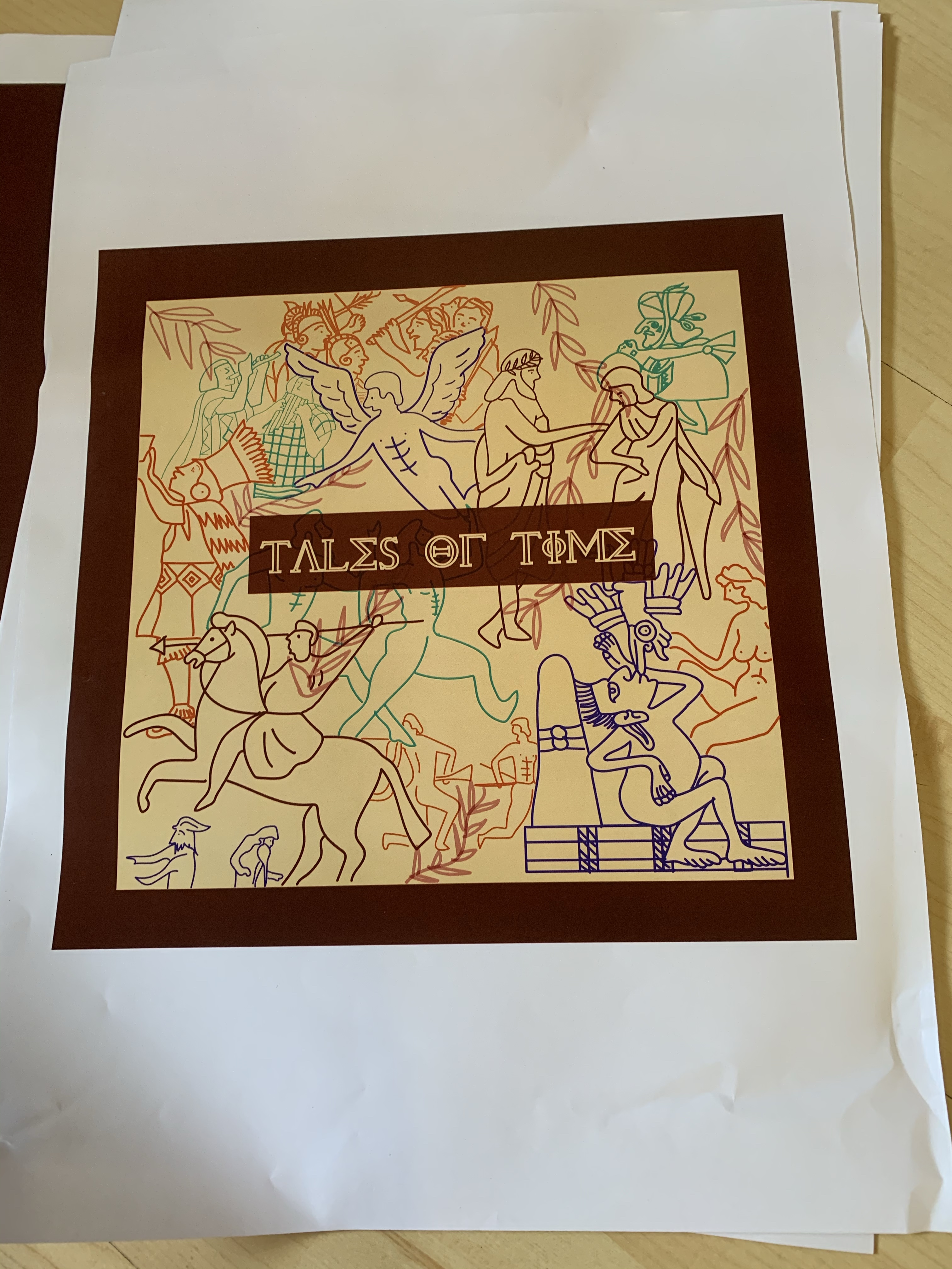
I then went on to refining my cover page and jacket for my coffee table book, as well as organising and cleaning up the layers in my illustrator file into four layers: My title, my illustrations, the information of the back of my jacket, and the last layer for the base rectangles. Doing this helped me make sense of what is where and made the process of creating my jacket and cover pages really easy. In my jacket, I began refining the lines in my leaves pattern, making them more careful and also reduced the thickness of the brush marks from 1pt to 0.75pt in order to make the detailing more visible and striking. Below are the illustrator files for both my cover and my jacket.
The jacket:

The cover:

I decided to make the cover for my book very basic and minimalistic, adding the main focus to the jacket only, as the cover will be hidden. I then arranged them into their respective layers.
I created master pages for the index of the book as well as the layout of the pages inside. These are the initial ideas and the initial process work of the inside of the book:

I learned the importance of snapping the text boxes in order to align them evenly. This makes it look more organised and neater.


Test prints of front and back of my jacket:
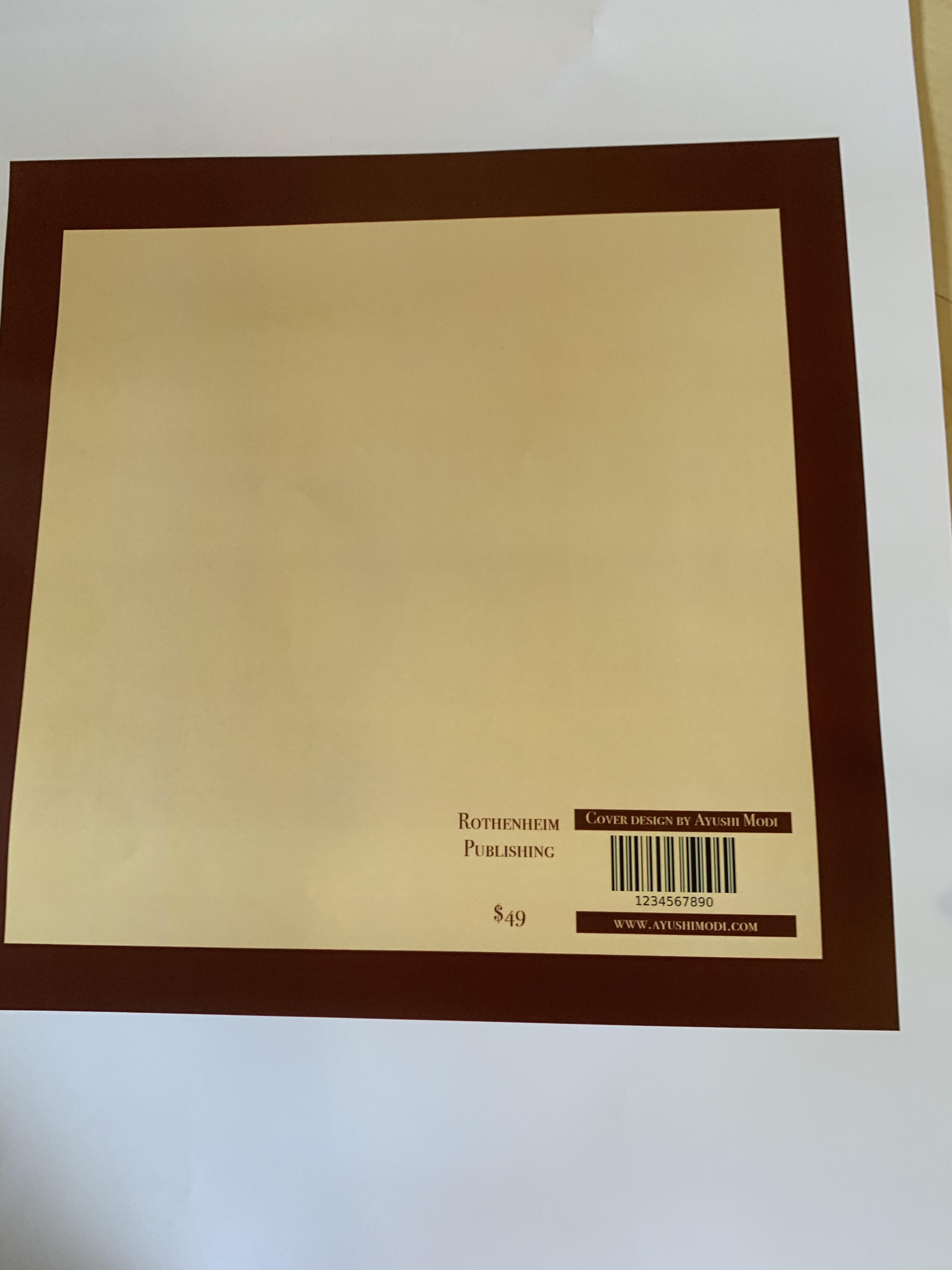
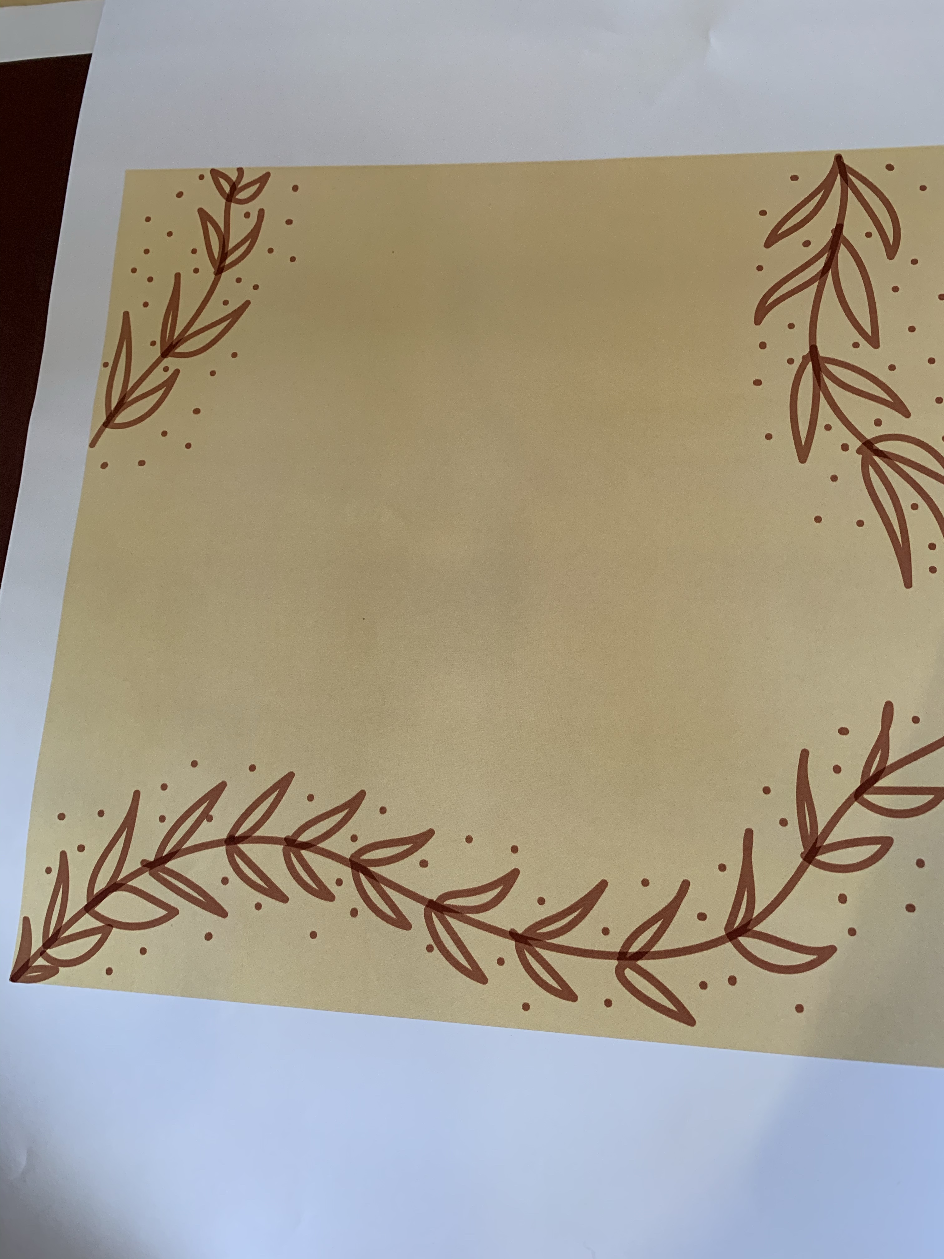
I went ahead and created test print of my front pages of the jacket and back page. I was satisfied with how the colours melded together and the font sizes and typefaces I used. However, I realised that for the inner layout (the one with only the leaves) I used really thick brush, to alleviate that issue, I edited my document and made the brush strokes thinner and neater.
For next class I plan on completing my bookmark and adding my designs to it as well as figuring out the layout of the pages inside and the section pages, too.
