
In this week of our imaging classes, we got more familiar with our coffee table book ideas and got to bounce suggestions and possibilities back and forth and discuss it further. I got to refining my layout and margins in my book and created the illustrations for my section pages. I decided to create three sections in total:
1. Monuments
2. Sculpture
The reason why I chose these three aspects in particular is because I believe that they speak for the civilisations that they belong to and represent the culture, identity and the lifestyles the people led.
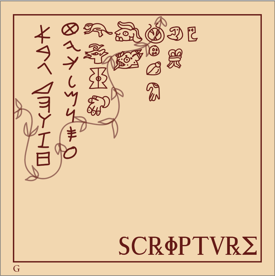
Final Section Pages


Process Work for Section Pages

I divided my section pages into different organised layers in order to navigate through them easily. The four main civilisations which I am going to be focusing on in my book are Roman, Aztec, Egyptian and Greek as they are all widespread and encompass a diverse range of cultures, religions and ethnicities from across the world. I categorised these illustrations into different layers in order to make it easier for me to adhere to the books recurring information. I used Illustrator in order to make these icons and illustrations because of the easy to use brush tool that allows me to make my illustrations. I took reference of realistic images from the internet such as pictures and sculptures and added my own element to it by using the allotted book colour scheme. I decided to clutter them up together to show the connection between the civilisations and make it look interactive.
In order to gain a better and clearer understanding of the format of my inner pages and their layouts,I came up with a very rough sketch of them.
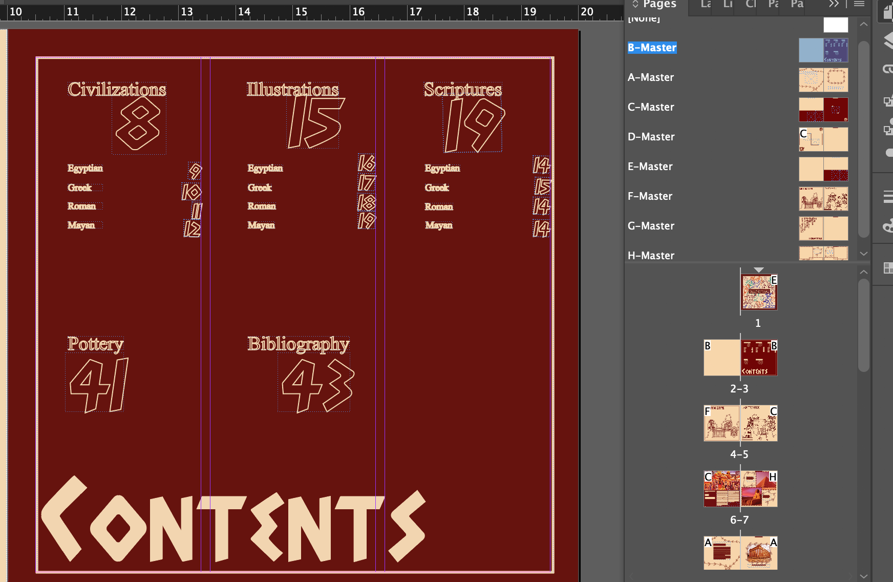
Inner pages layout:

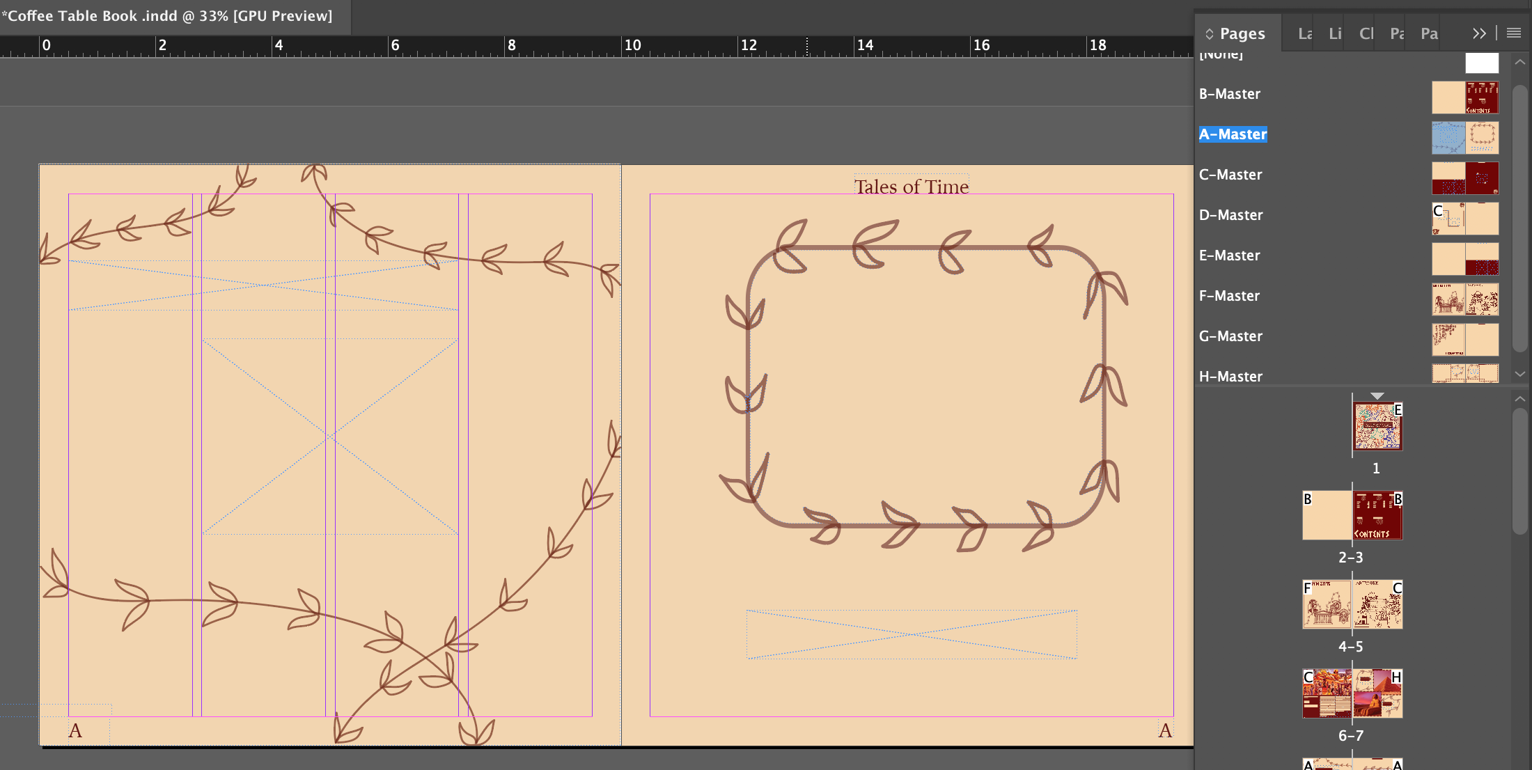
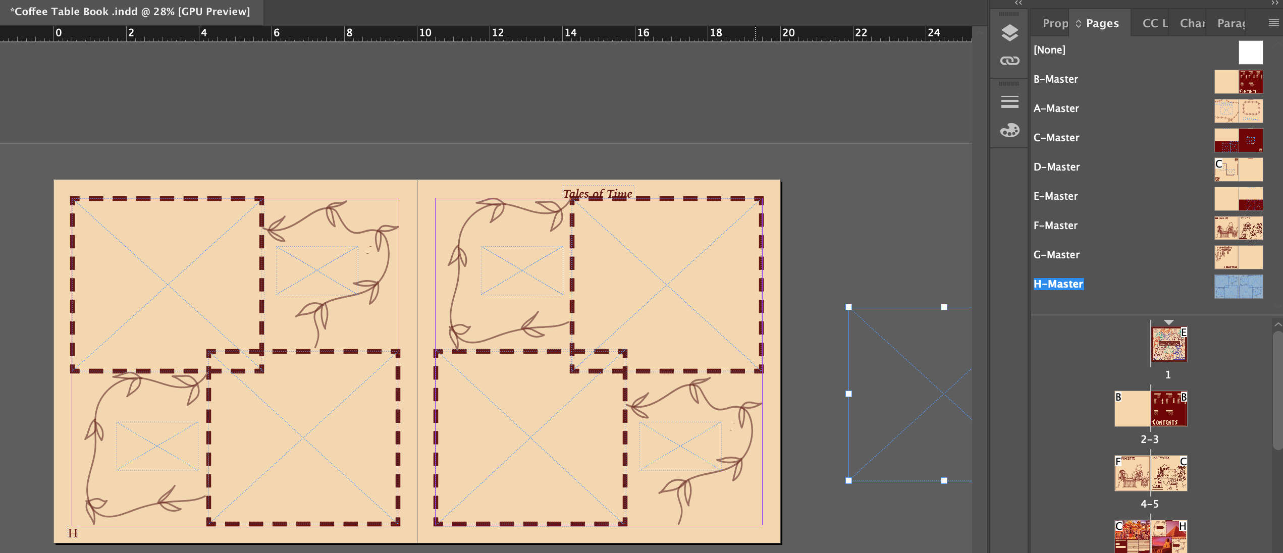
I replicated this format into InDesign and these were the results:


Experimenting with the adjustment bar on photoshop
This week I got to get more familiar with the adjustment bar on photoshop. I got to experiment with contrast/brightness, exposure, colour balance and channel mixer. I learned how to manipulate the curves tool in the adjustment bar, increasing the levels of contrast and adjusting the colour balance, shifting the colour scales, saturating parts of the picture and creating shadows by darkening certain parts in order to create the effect and look I wanted for the image so that it could match the colour scheme of my coffee table book. Later, I began collating my information and adding theses effects for my pictures.
Below are the inner pages I created with the help of the adjustment bar tools.


In order to get my desired results for the image, I tipped the colour balance scale more towards the colour red and away from yellows, greens and blues, giving it a reddish/orange effect. Using this tool to manipulate the contrast of pictures was educational and I realised how easy it can be to adjust these images. I also got a better understanding of why artists and photographers edit their images in the first place — to make certain aspects of the picture stand out and evoke a mood and feelings, too.
Lastly, I got to refine my paragraph styles on my InDesign file. I wanted to have several paragraph styles so that I could access them easily and use them in different parts of my book. I chose to have 4 paragraph styles in total, two were for subtitles (Adonais and Iowan) whereas I reserved another two (Iowan and Times New Roman) for lengthy paragraphs. Creating these styles taught me how to organise my settings in a better way instead of going haywire with all of the typefaces and font sizes.
Below is the documentation of my paragraph styles which I used in my book:

