
In the fourteenth week of our Time classes, we got to discussing how our whole project can be assembled together and gathered all of out process work into one video. These were the discussions we had outside of our classes:
While discussing our ideas and the movies, we drew parallels among the movies and recurring motifs and shared our perspectives about what we think the movies’ messages were and how the themes overlapped. We also got to understanding how these movies can be interrelated and communicate with each other in order to create a broader narrative. We settled on five themes: Acceptance, progressive feminism, loyalty, forgiveness, and culture. We then narrowed it down further to Acceptance as the common theme and depict the different elements of the movies we watched into one integrated artwork. As we discussed more on our group chat, we got a clearer understanding of each other’s movies and got to dive deeper into the intrinsics of understanding metaphors, themes and narratives.
I then got to completing my final two sided digital poster:
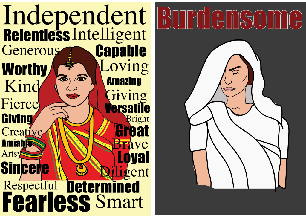
I added colour to the poster eventually and used this particular element to also convey a message. White and black are the absence of colour and hence they can signify emptiness and nothingness, therefore I used the white for the sari colour on the right side of the poster (for the widow) and black as the background. I decided to use red as the colour of the typeface because it can be associated with a “label” rather than just a mere description. For the bride on the left side of the poster, I used vibrant colours for her sari to show that she is married. I also used bold fonts on the poster to make the words stand out and look loud, whereas on the right side, I only put one world for dramatic effect.
