Week 1 | 2nd August, 2019 | Isha / Jai Ranjit
“We cannot speak other than by our paintings”
–Vincent van Gogh in a letter to his brother Theo
Loving Vincent
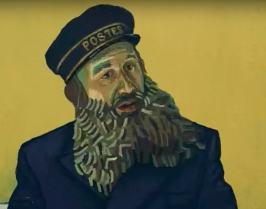
In week one of drawing class, we watched an oil painted animation called “Loving Vincent”. This film chronicled the events of the famous Dutch impressionist Vincent Van Gogh’s life through flashbacks and what drove him to commit suicide. It was made by over 100 artists who used Van Gogh’s impressionist painting technique to narrate his story and what happened after he died. The whole film was created with over 66,000 oil paintings with stop motion cinematography. I learned how Van Gogh’s paintings, peculiar for his time, changed the art world forever, as people started to realise that his style strayed away from the basic and realistic paintings of the late 19th century. The film had several elements of movement. I noticed how the different impasto strokes of oil paint positioned differently in each panel of the film created a sense of movement in the painting. I noticed how artists manipulated their paintings with different colour palettes and stroke thicknesses to give the illusion of light, texture and emotion.
For instance, in the image below, there is a sense of light and depth in Roulin’s beard created by thick and light impasto strokes as well as highlights on the left side of his face that give us a sense of where the light is coming from. The different shades of brown, black and yellow also add texture to his beard and contour his face, bringing it out more.

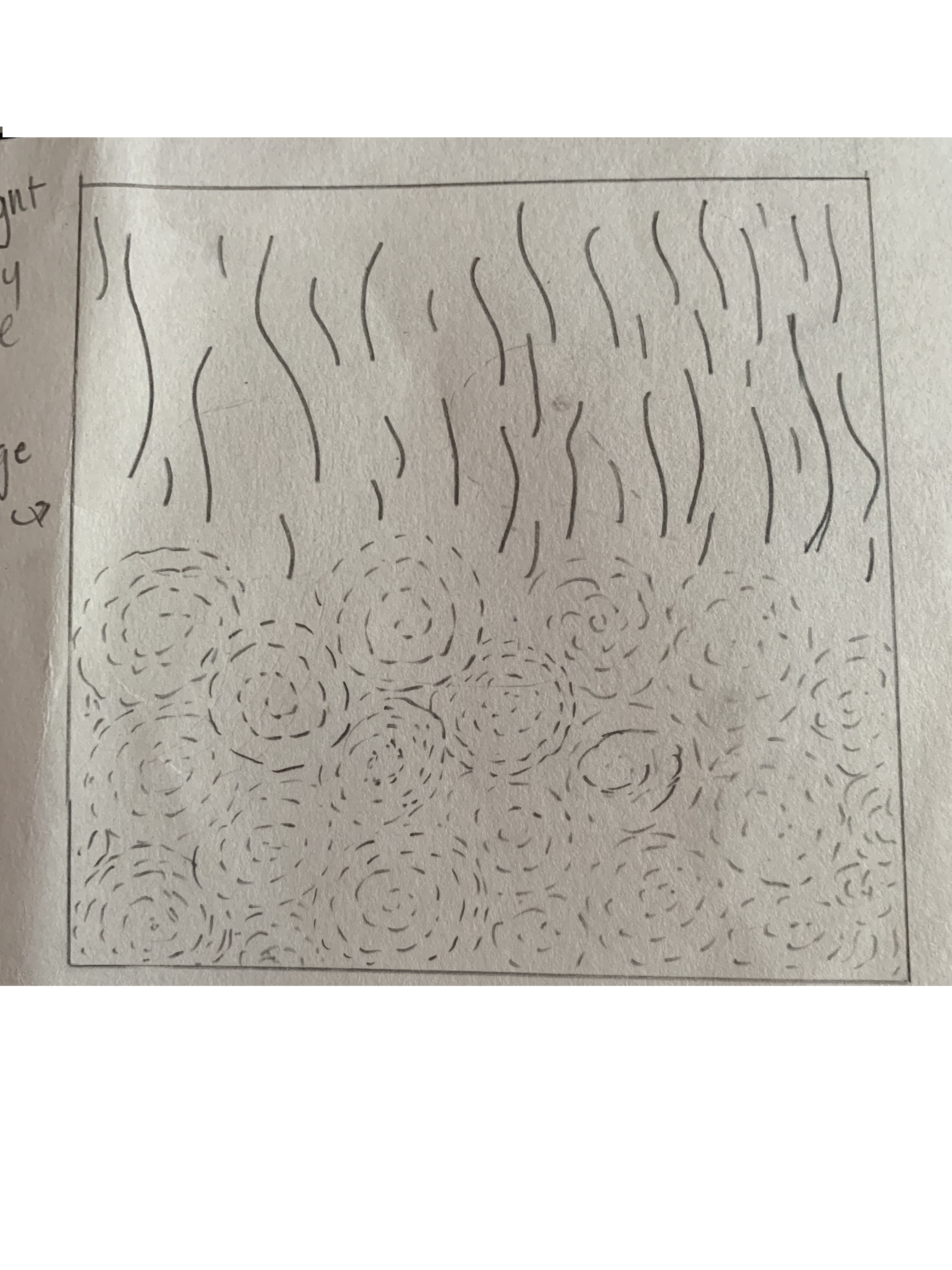
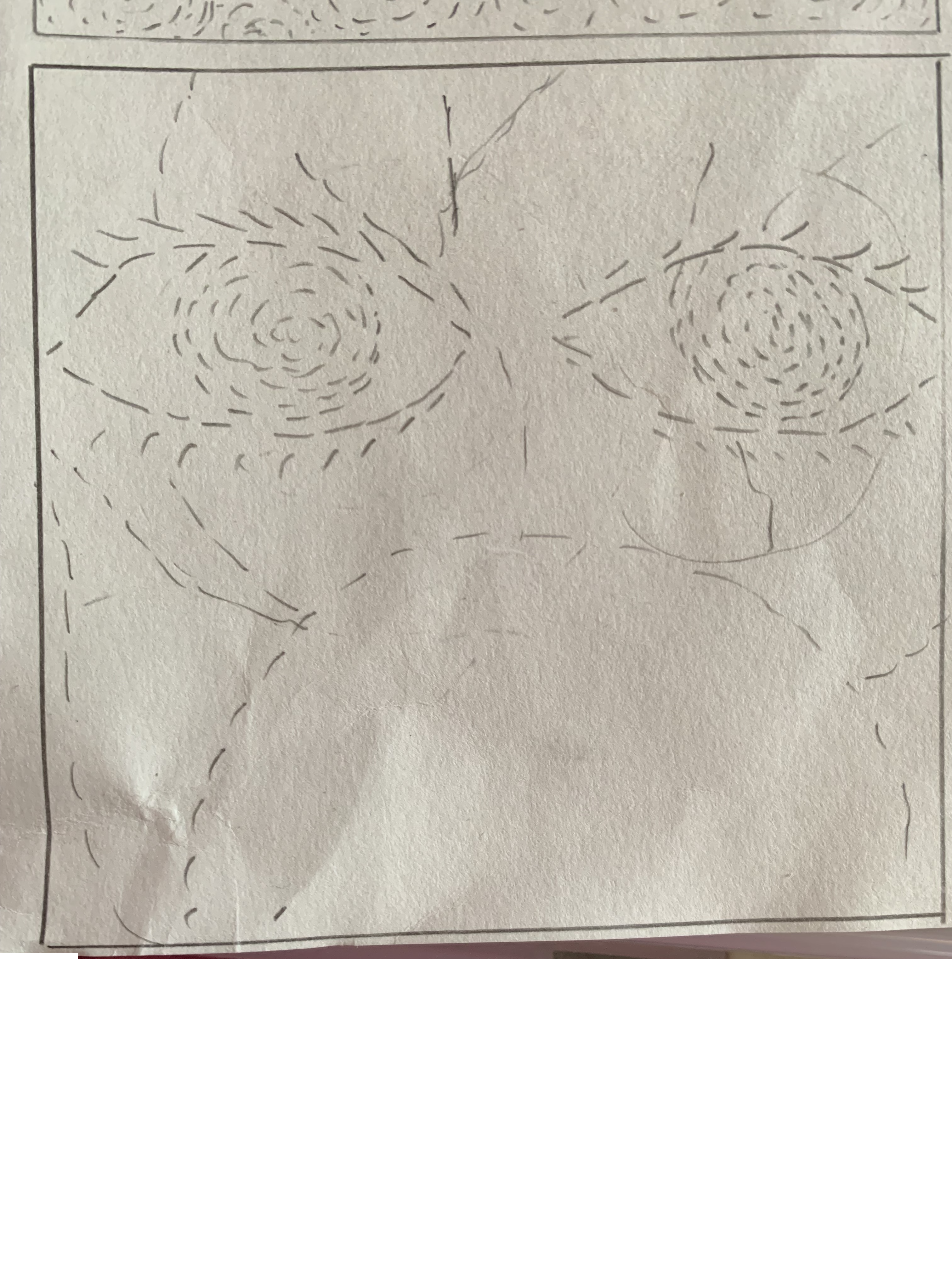
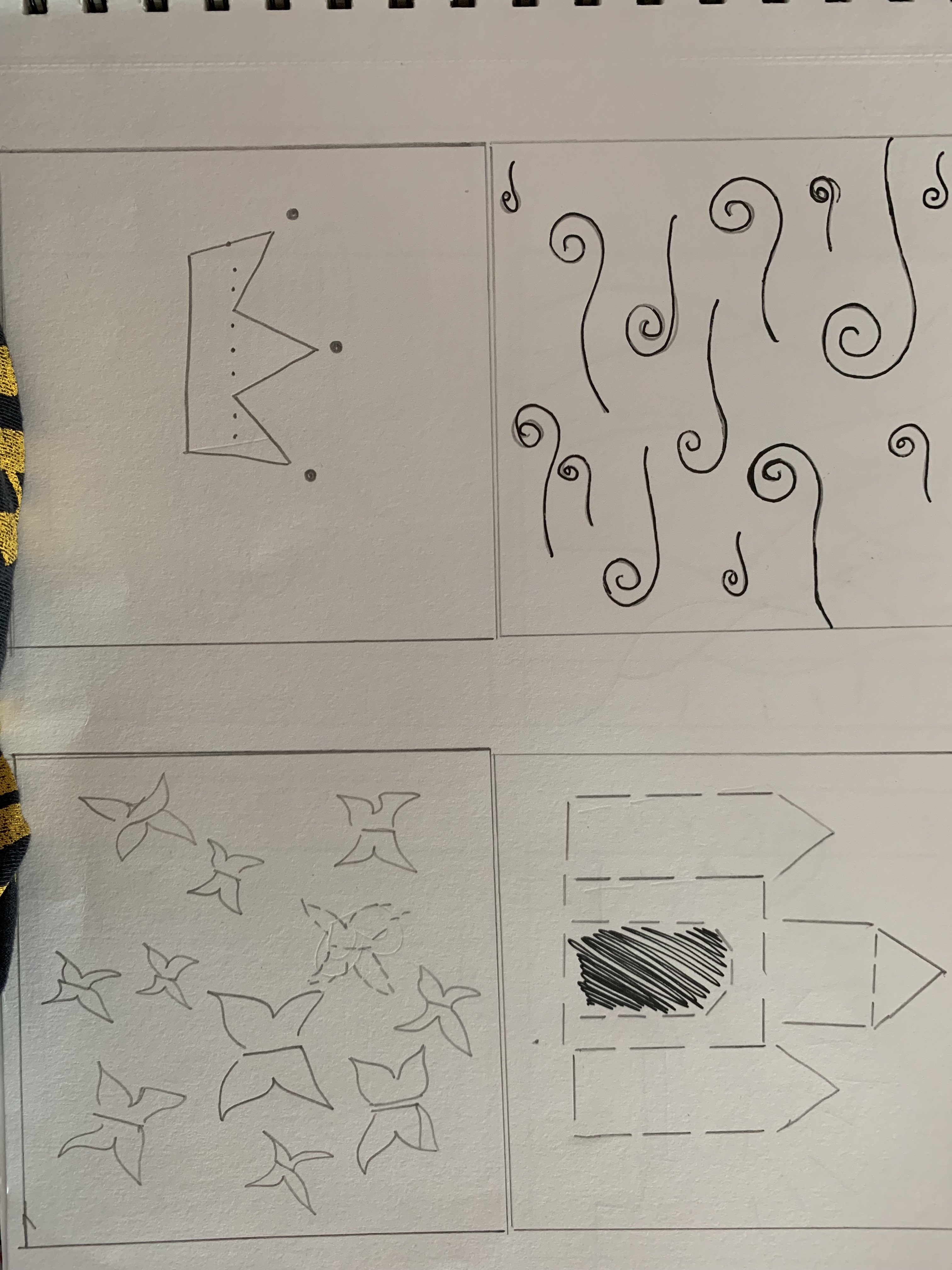
Charcoal drawing (Activity)
For the second half of the drawing class we experimented with charcoal on news print sheets. We were taught to adhere to different charcoal thicknesses in order to bring out the effects that we wanted in our drawings. The softer the thickness, the darker and thicker the charcoal would be on the sheet. We could then choose to draw with charcoal for the rest of our class and complete the project at home.
This was one of my first times using charcoal, so I wasn’t really used to the feel of it in my hands and the unforgiving mess it is bound to create with one wrong stroke. This was mainly because I was used to drawing with pencils or paints, charcoal is a very intense medium. Despite that, I was able to teach myself of how the different thicknesses and softnesses of the charcoal create different effects on the newsprint sheets. I also learned how an eraser is significant especially when it comes to charcoal. It is a tool, I learned how to use it to create the illusion of light, texture and shadows, too.
Furthermore, I noticed that charcoal consists of bigger grains that create darker and richer tones, which is why it is easier to use for shading. Graphite on the other hand is harder to blotch which is why it can be tedious to use for shading.
Week 2 | August 9th, 2019 | Jai Ranjit
“One must always draw, draw with the eyes, when one cannot draw with a pencil.”
-Balthus
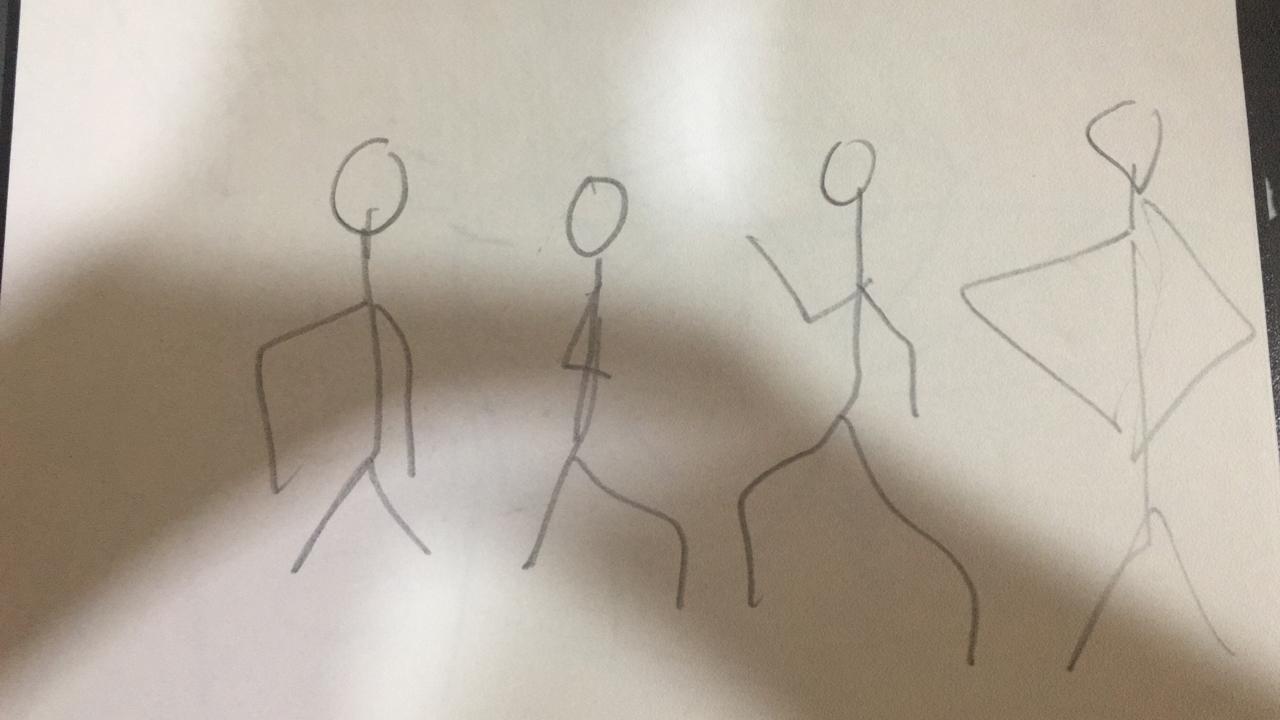
Today in Drawing class, we were taught gesture drawing. Gesture drawing focuses on the posture, figure and form of a subject. It does not quite focus on the detailing aspect of drawing but gives the artist a basic idea of the lines and directions they have to begin drawing in. It is the very base and foundation of drawing figures.
To start our activity in class, we were instructed to come up front in class, one by one and act out a pose. The rest of the class had 10 – 60 seconds to complete a gesture drawing. Each time lapse varied based on the amount of detailing we had to include. For example: the glasses, clothing, facial features, etc.


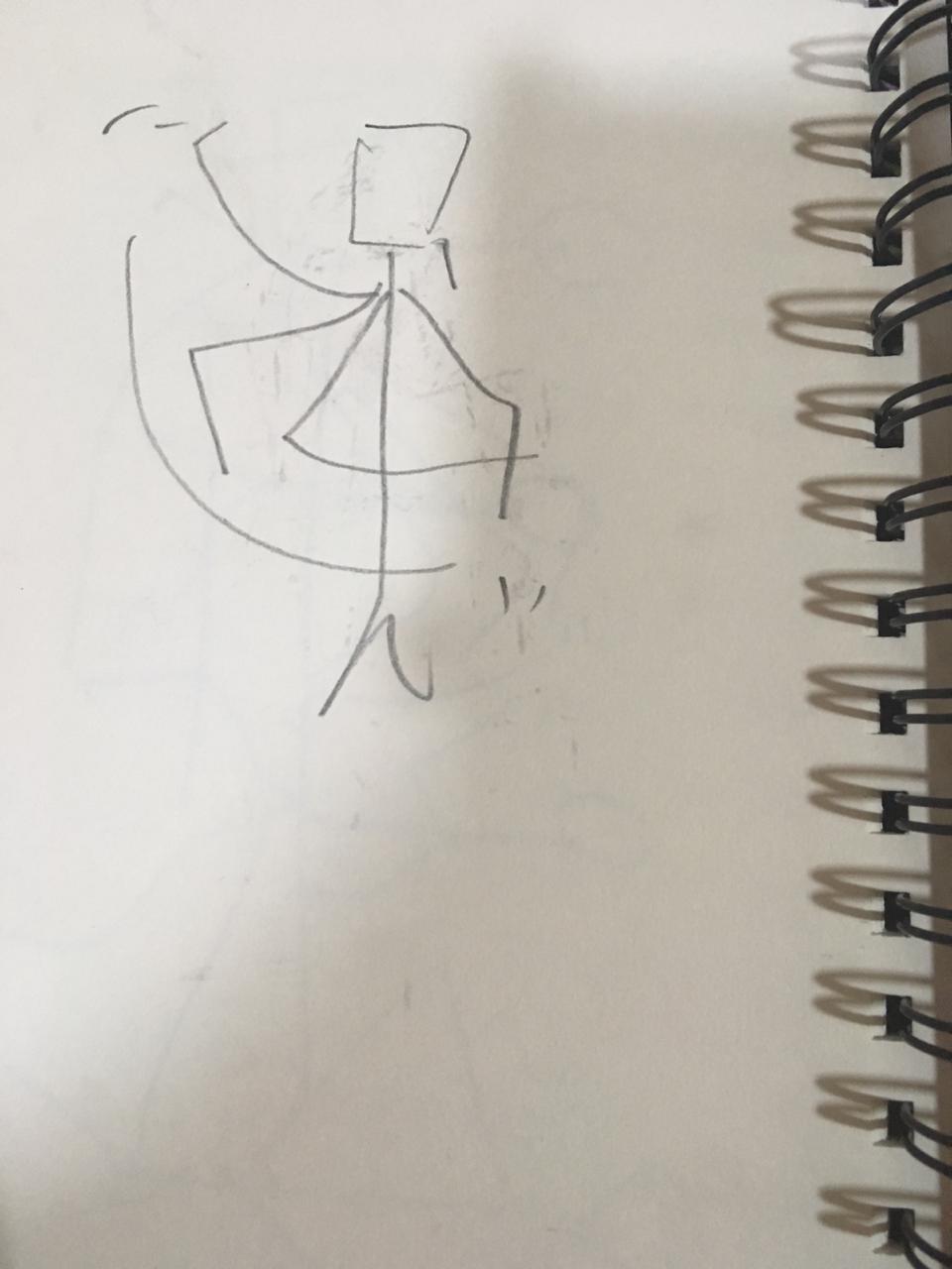
Our second activity included exploring the figures, space and objects across campus. Our group of four was assigned to explore the fourth floor fashion designing room, and gesture draw five scenes in a total of five minutes.
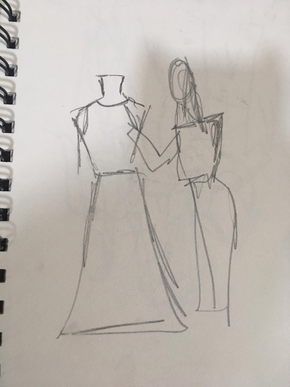
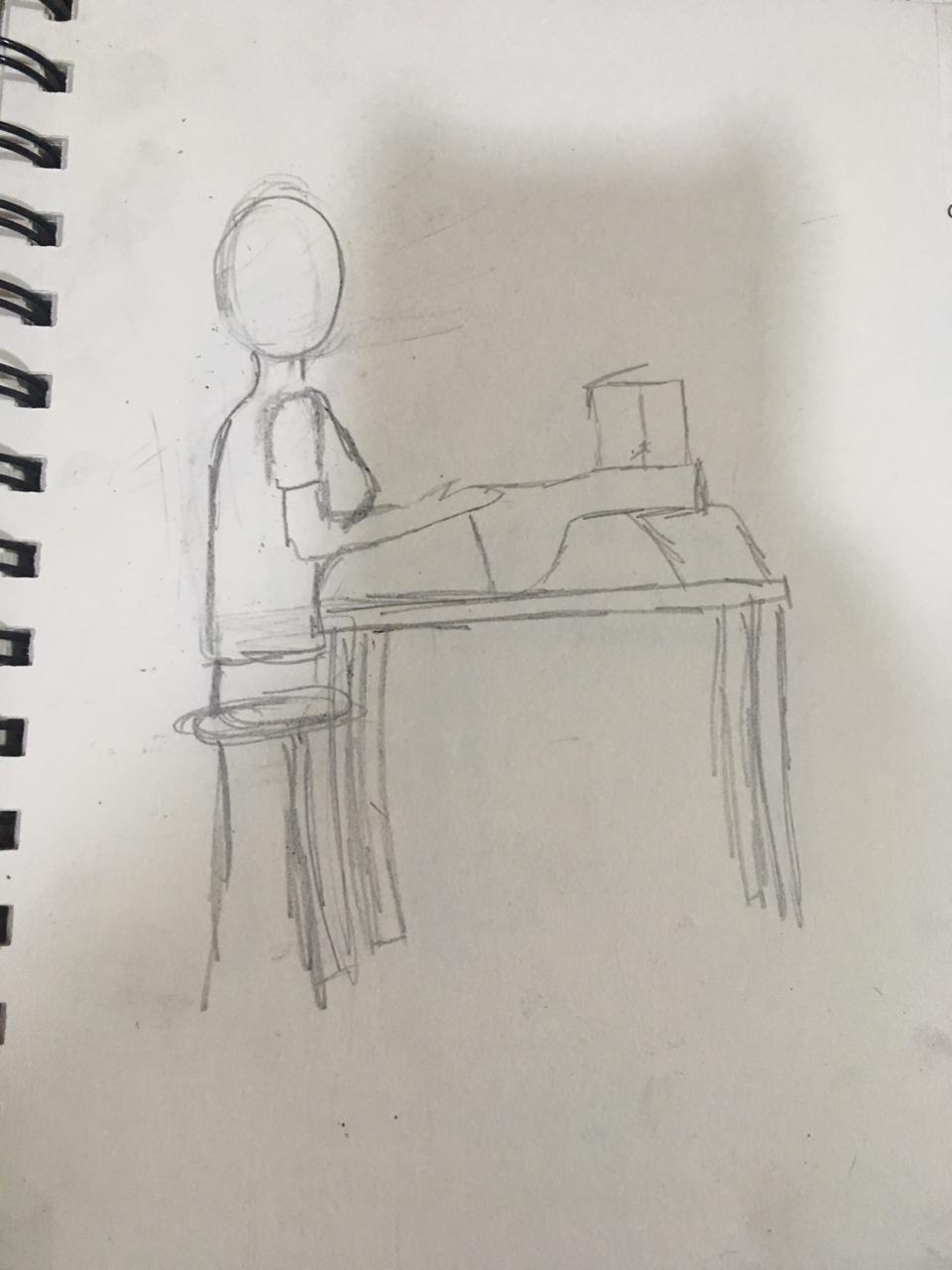
We were then told to refine one of the sketches by highlighting lines and features. This is my sketch of a girl sitting at a sewing machine:
This activity taught me about the very basics of drawing. I had to unlearn the overwhelming idea that all artists who excelled at realistic figure drawings had a natural flow for it. I learned about how the very foundation of a figure drawing is a simple gesture sketch, this gives artists a rough idea of where to start and how to start.
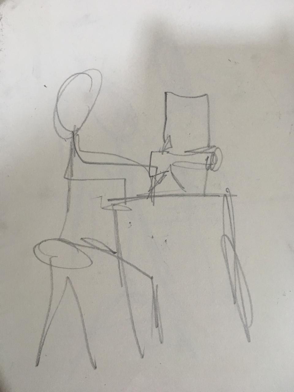
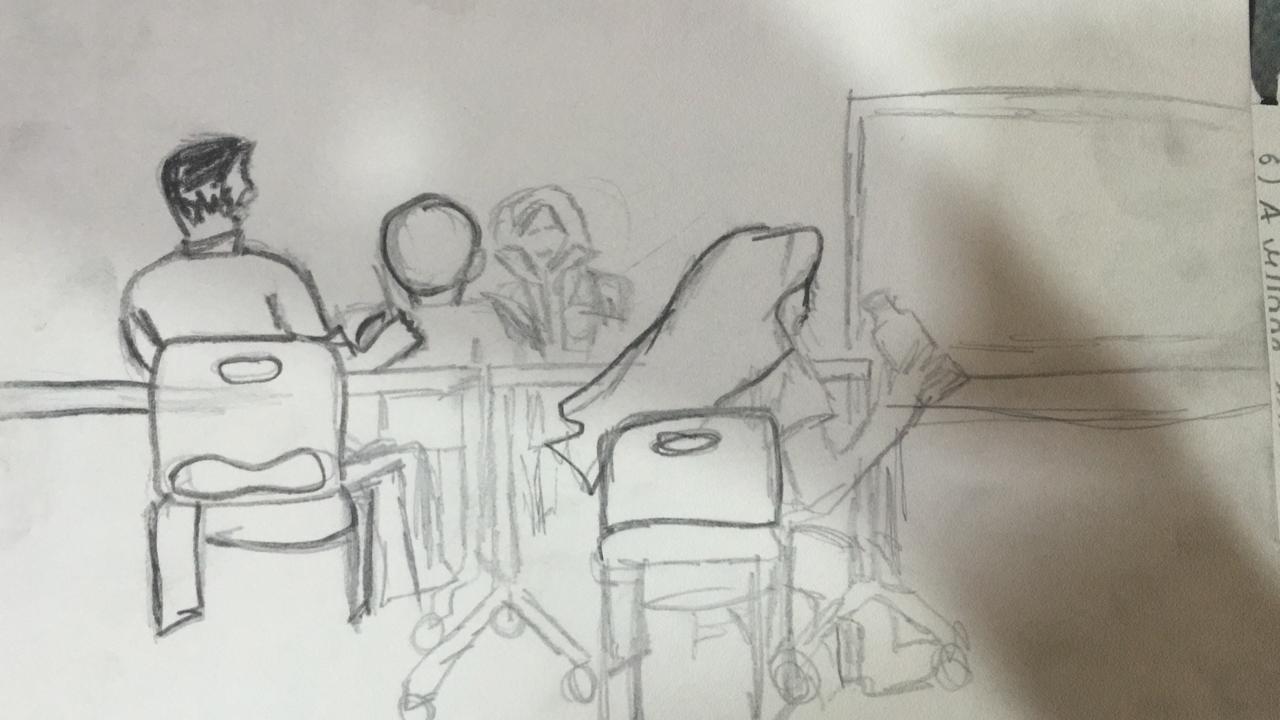
We then moved on to broader scenes. We explored the space around us in the classroom. We were told to sketch our classroom from a different vantage points. This activity helped me gauge a better understanding on how different objects and settings around figures create context and understanding in a picture. I also bettered my skills in freehand perspective and approximating where certain objects interact with each other in the drawing. These are the two sketches I did in class:

Week 3 | August 16th, 2019 | Jai Ranjit
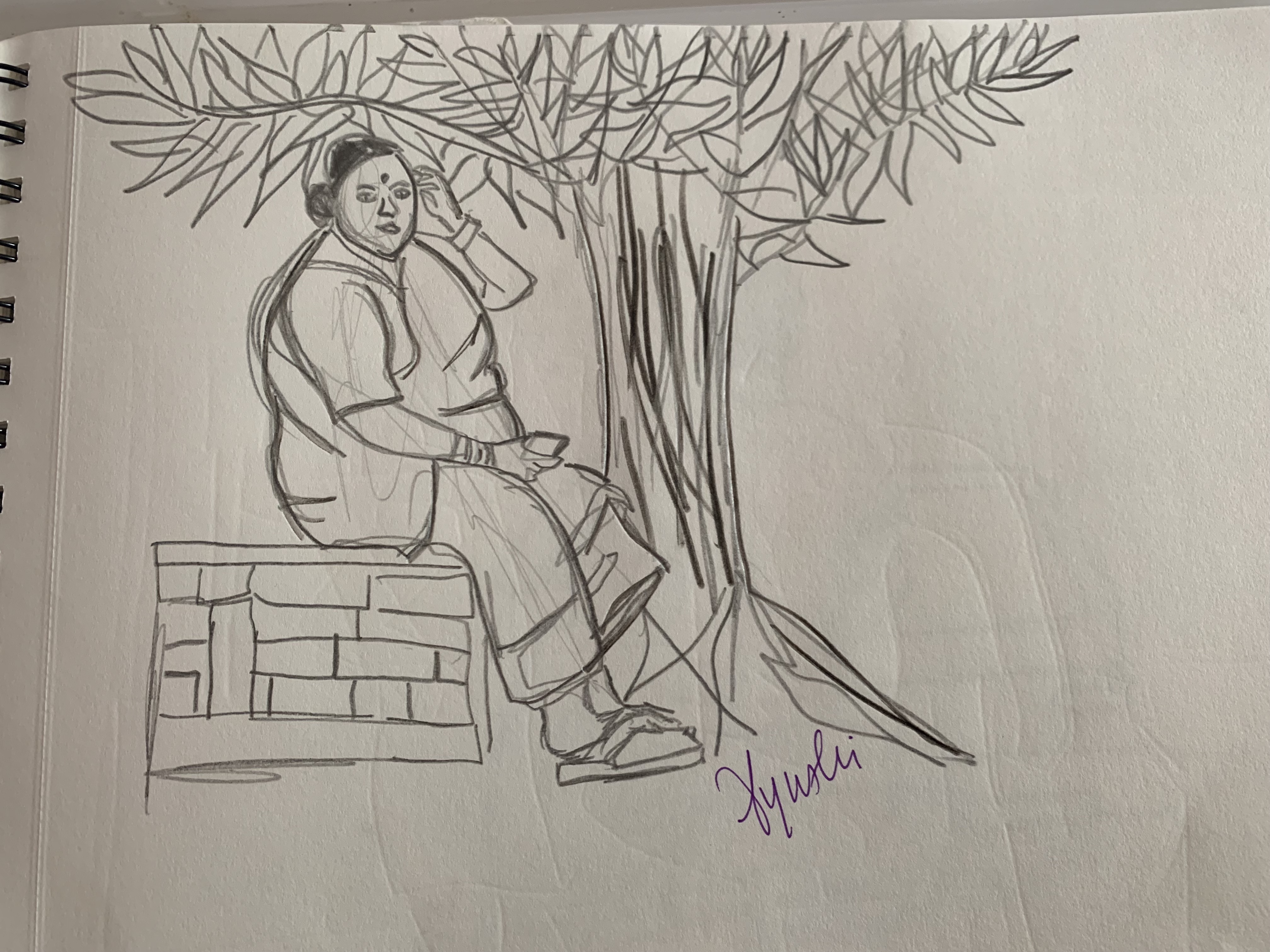
In the third week of drawing class, we were told to show the drawings we did at home for homework. I visited the slums near my house, old photographs, my sister’s dance classes and asked some of my family members to pose for me to sketch them. This was a really seminal experience and activity because i got more acquainted with different methods of drawing and got more comfortable with it.
my sister dancing, and an old photograph 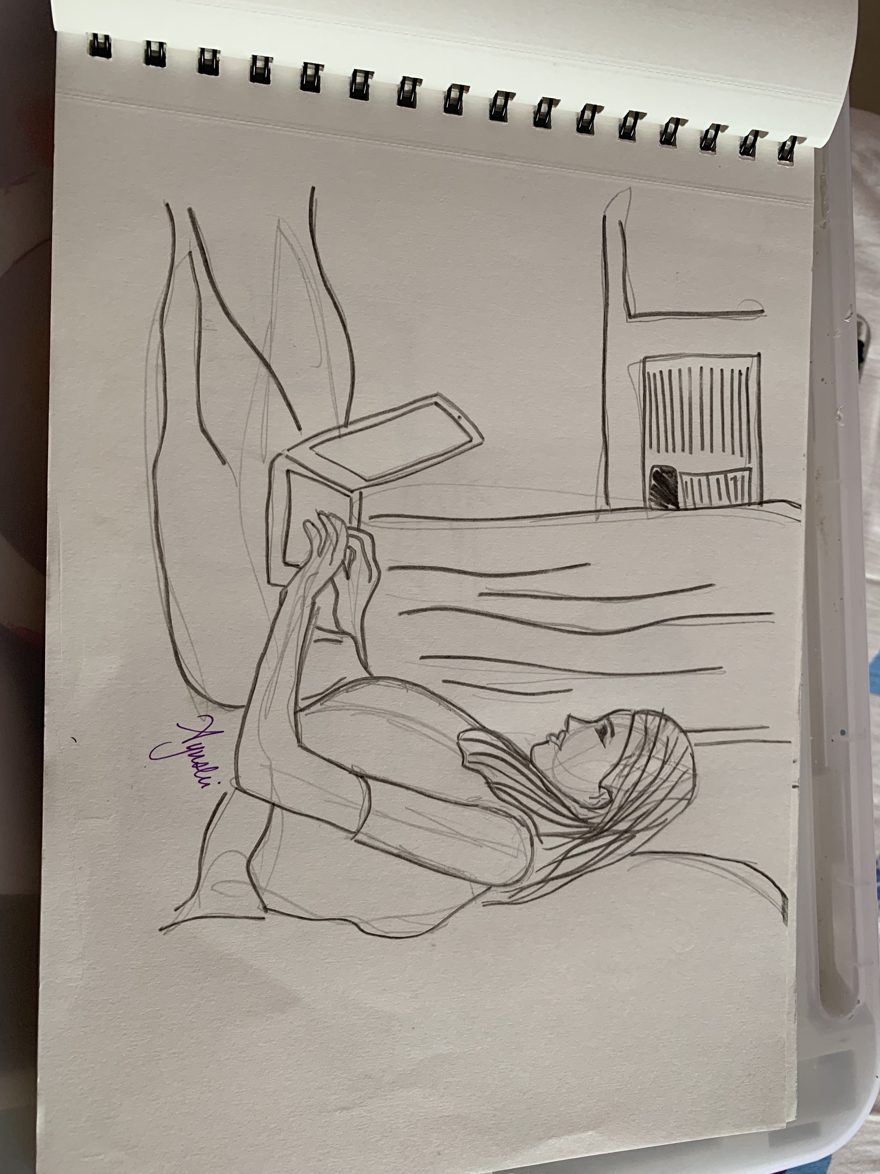
My sister on her computer 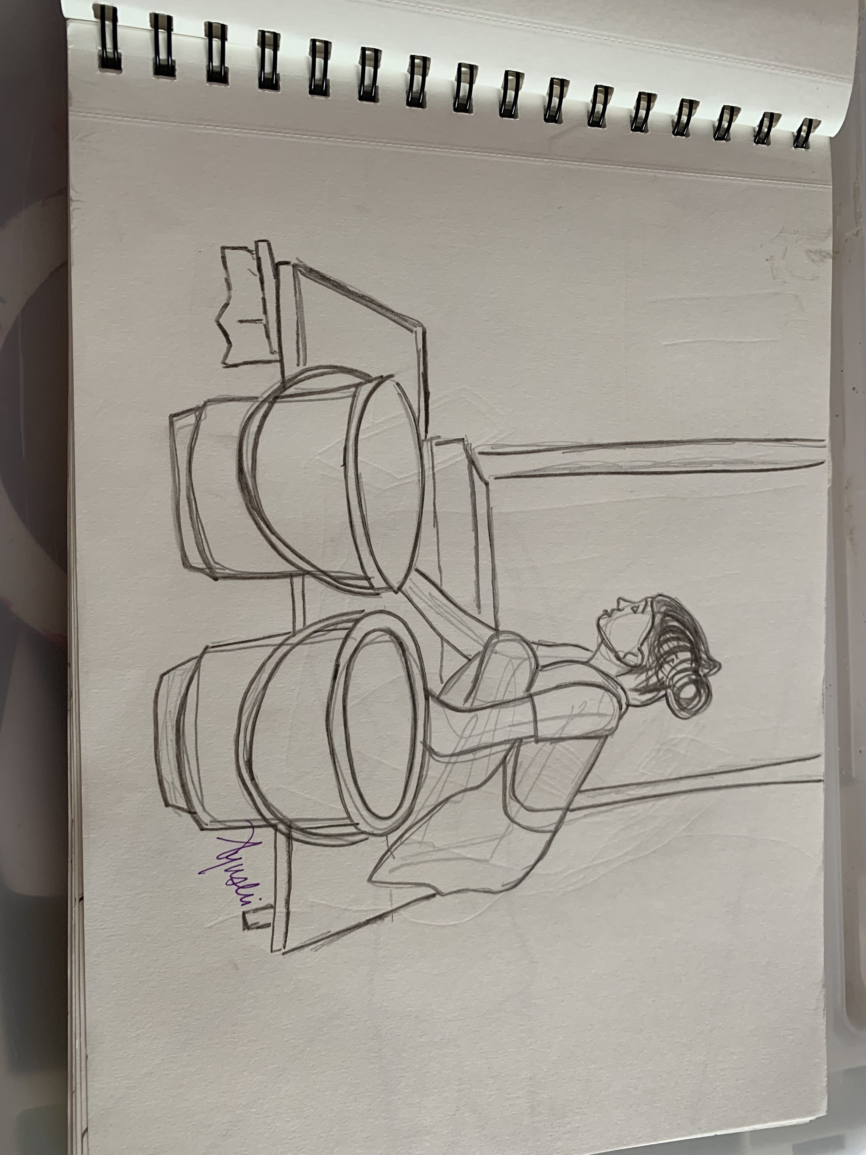
a woman washing clothes outside her house

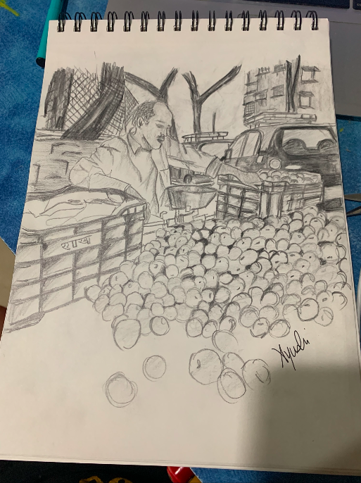
In the third week of Drawing class, we learned different sketching techniques to create depth, value, different tones, textures and a lot more when drawing. The techniques we learned were stippling, scumbling, hatching, cross-hatching and scribbling. We were then told to use these methods to create four sketches of photographs we got to take ourselves of different places. 2 sketches had to be of a place during the day and the other two had to be during the night. Below is a sketch I finished in class today:
These are the sketches completed at home:


When sketching these sketches, I noticed how different drawing techniques that we learned in class can create different effects. While I still battle with creating the appropriate light effects in my sketches, I think I’m good at creating shadows and showing depth. For example, in the tomatoes, (the first sketch) I showed value in the gaps and spaces between the tomatoes and differentiated each tomato from the other using the “scribbling” technique. I could have made it more obvious that the fruit on the table was a tomato. Tomatoes seem to have a natural and polished shine in the light as opposed to other fruits. If I could’ve managed light in a better way, I think I could’ve brought out that effect.
In the fourth and final sketch, I think I managed using space to create an accurate amount of context, so that the viewer can gauge the environment and interpret what’s going on in the picture, something that I have struggled with in the past. However, I could’ve created a more realistic depiction of the hanging flowers by using the scumbling technique to showcase the complexity of the petals.
Week 4 | August 23, 2019 | Jai Ranjit
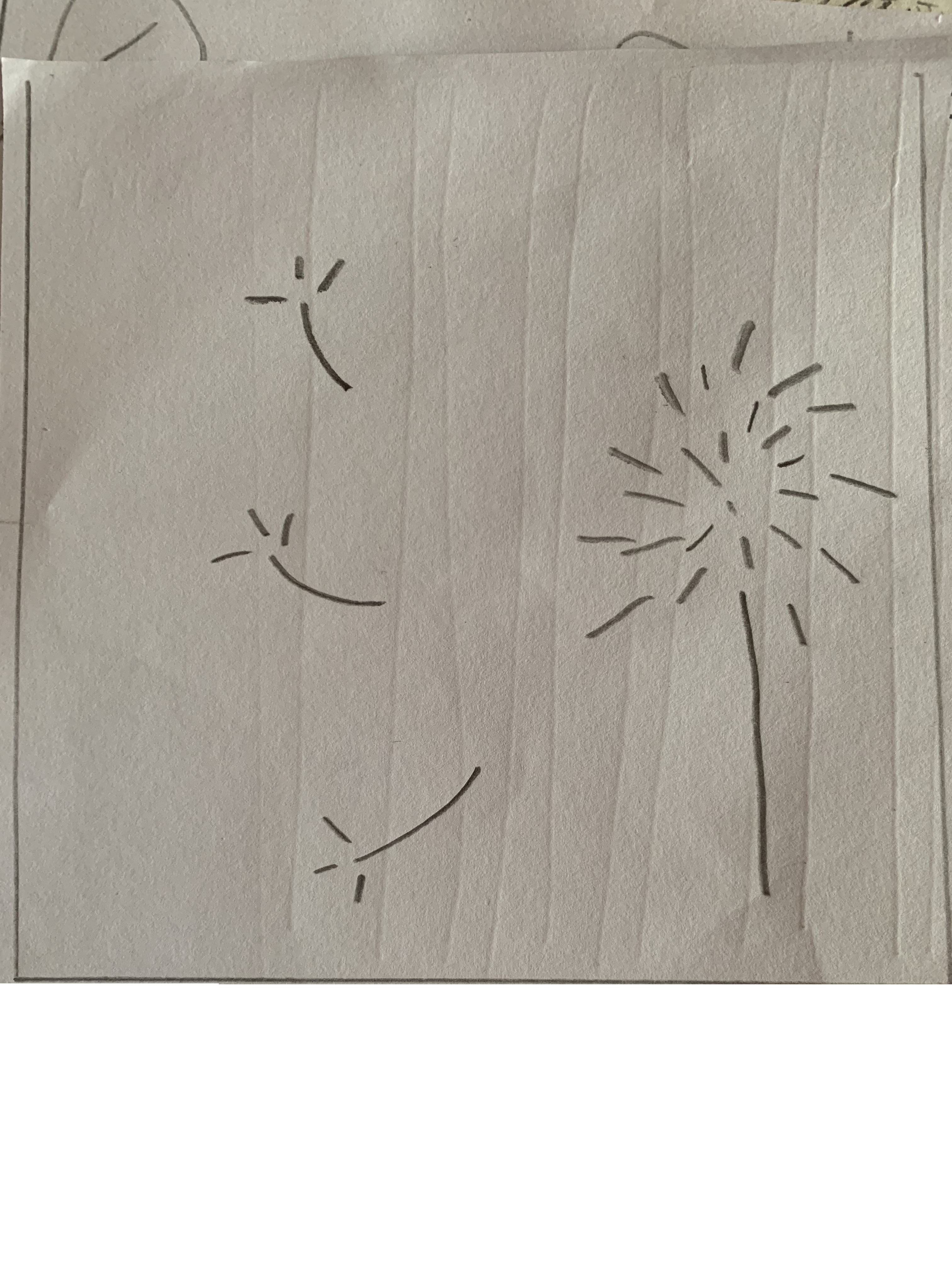
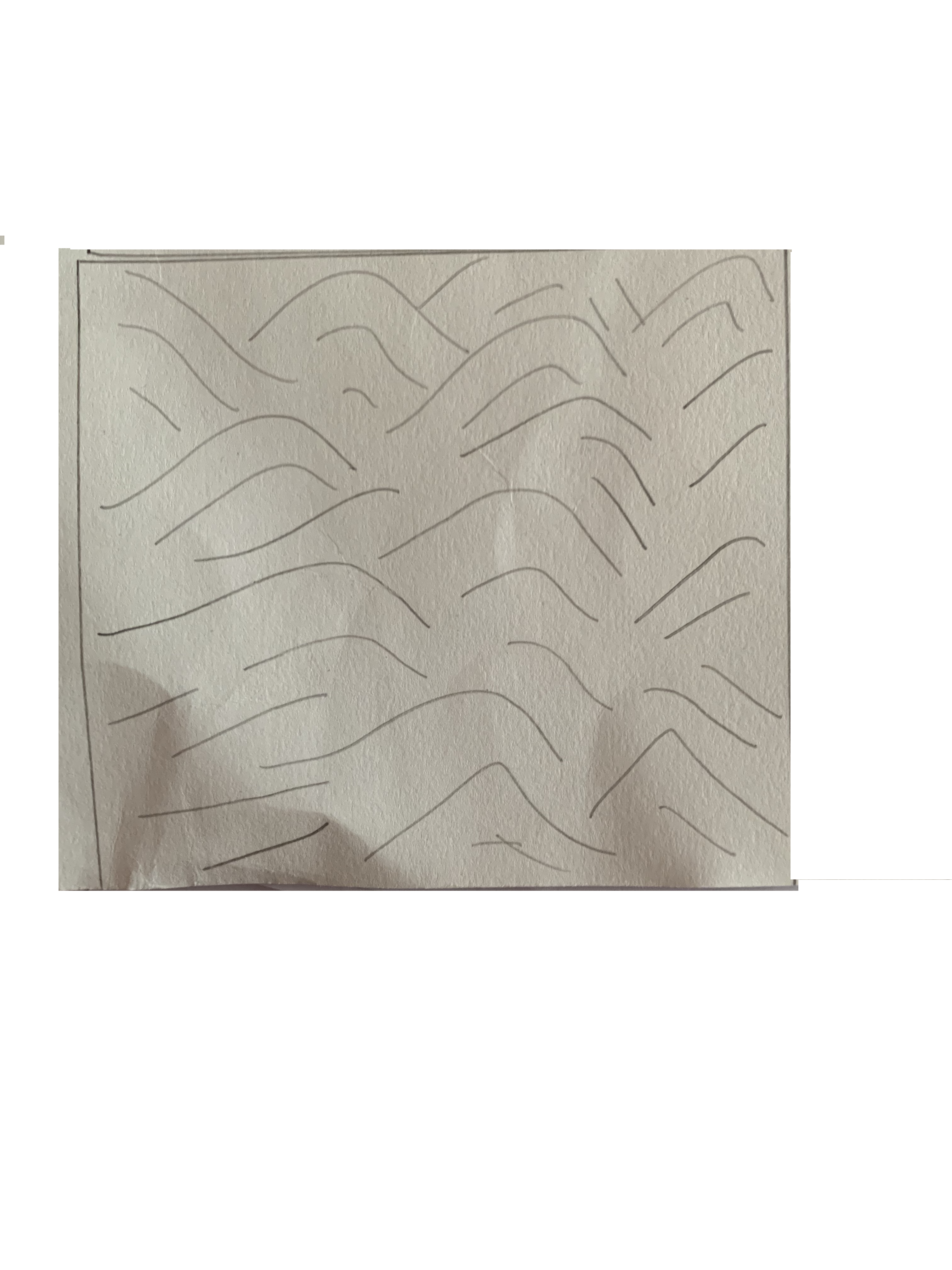
Since we were young, we all started out drawing with a single line. Whether it was making random lines on a piece of paper or writing words, everything started with a line. Today we learned how lines can be used in drawing to depict objects.
Line art or linear drawing is entirely made up of distinct curved or straight lines. These lines can be used to create direction, motion, value, tones, shapes and figures. They can depict two dimensional or three dimensional objects.
We got acquainted with linear drawing by drawing the very basics of things: our hands and then the objects around us. At, first I was really confused with the whole concept of line drawing. I thought it was all about filling out an object entirely with lines, which ended up making my first two drawings of my hand very chaotic and messy:
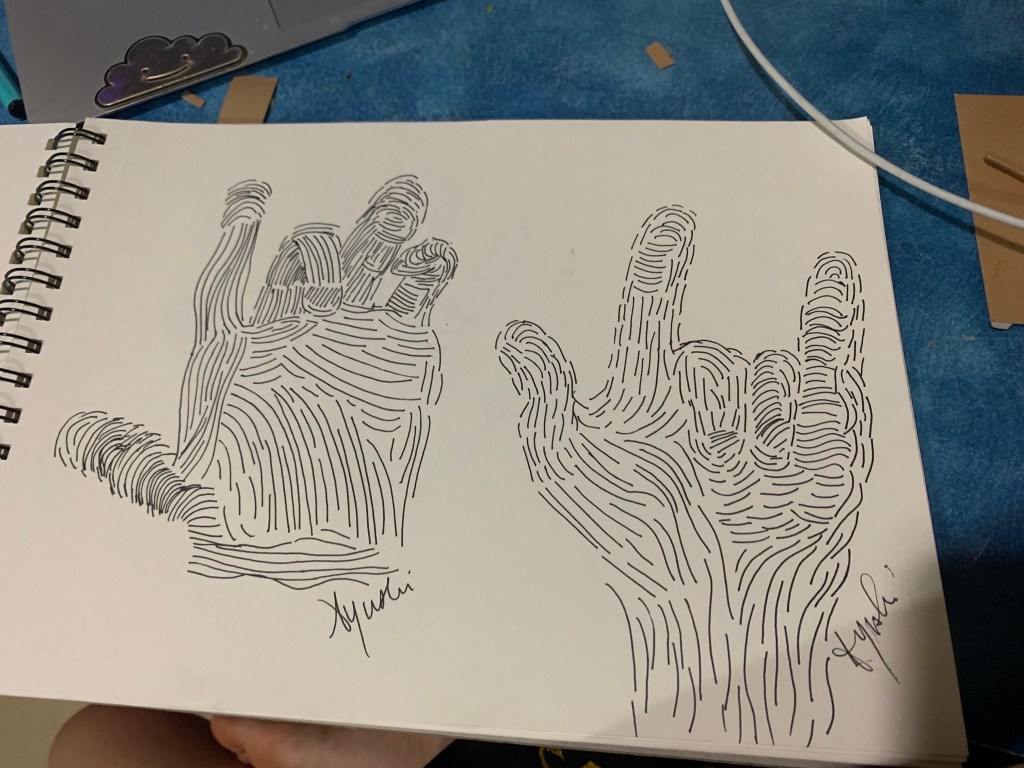

I then learned the key: which was to go with the flow, quite literally. I followed the curves and indents of my hand and depicted those instead of making a lot of chaotic marks. This made it easier to identify the fingers, palm lines and gauge where exactly different aspects of the hand start and end.
I struggled and made sure to make lots of mistakes, especially because we were told to use a pen. Despite the initial difficulty, through trial and error, I managed to figure out how to follow the curves and let the hand draw itself and not complicate the drawing.
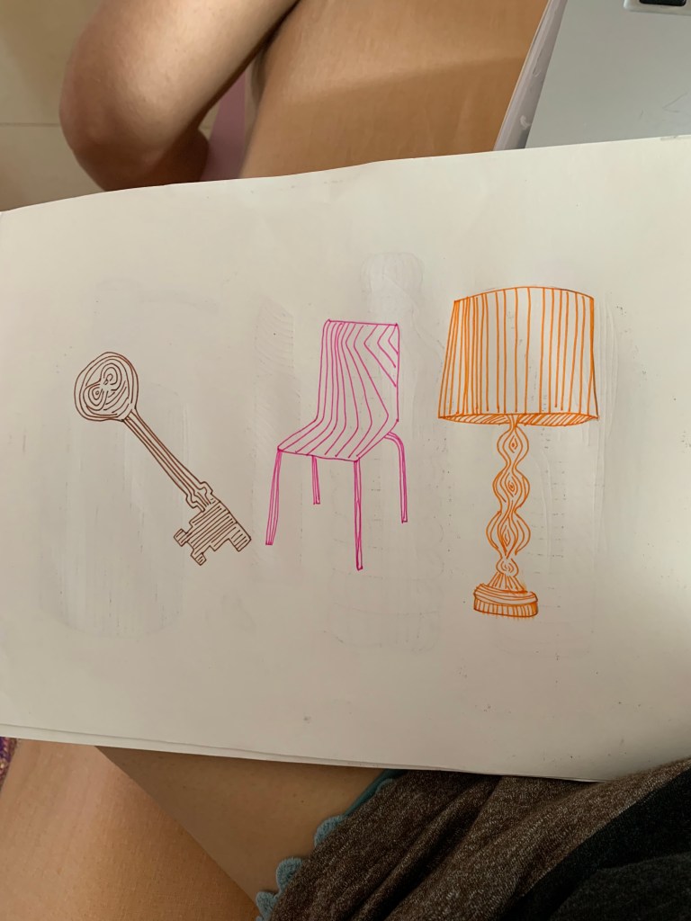
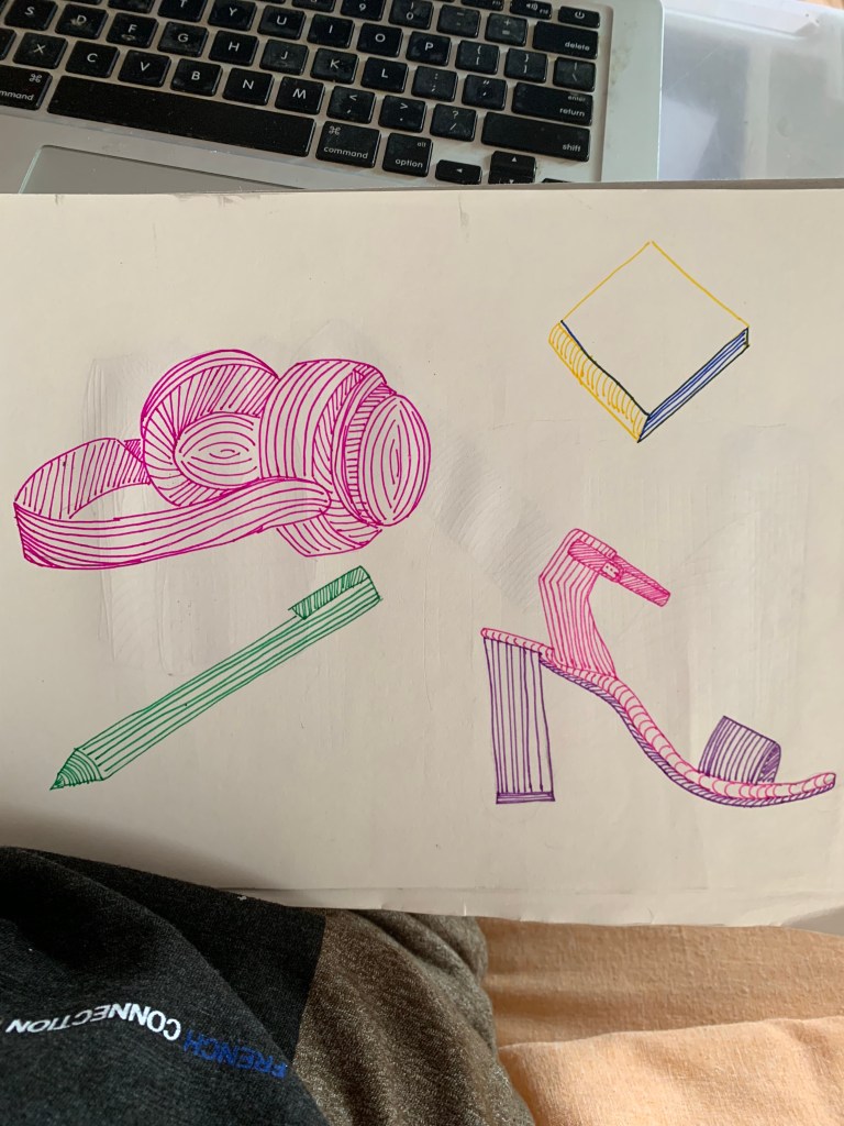
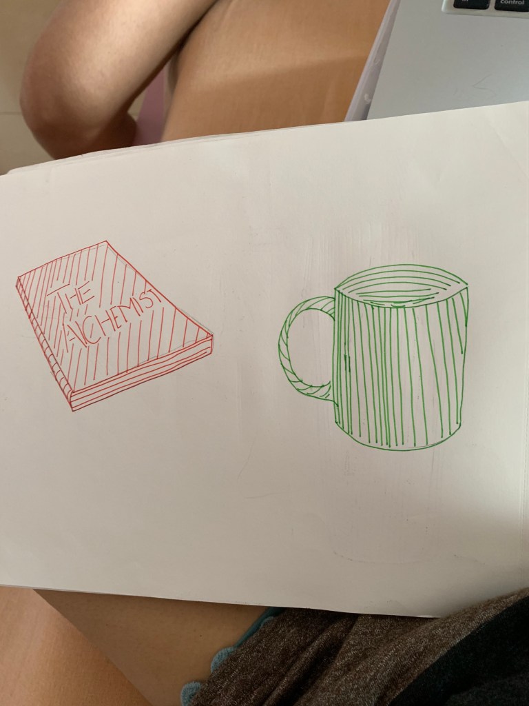
I then went on to creating objects and faces:


Patience is Key
The good thing about drawing is that it enhances your patience. Especially when it comes to linear drawing, I learned that you need to be very specific with your lines, and the flows those lines create, because when you put them all together, they create a whole. Using an unforgiving medium such as a pen, was at first very difficult and frustrating for me. Nevertheless, after several tries, I could teach myself the different contours and curves of a face. I learned the ways in which the cheekbones curve from the ear to the nose for most people,(high cheekbones) and for some, the cheekbones go from the ear to the lips (low cheekbones). It takes patience to notice these attributes that each person carries (something I think I still need to work on) and its even more wonderful to see how it can all play out on paper with nothing but lines.
These are the linear drawings I completed at home:


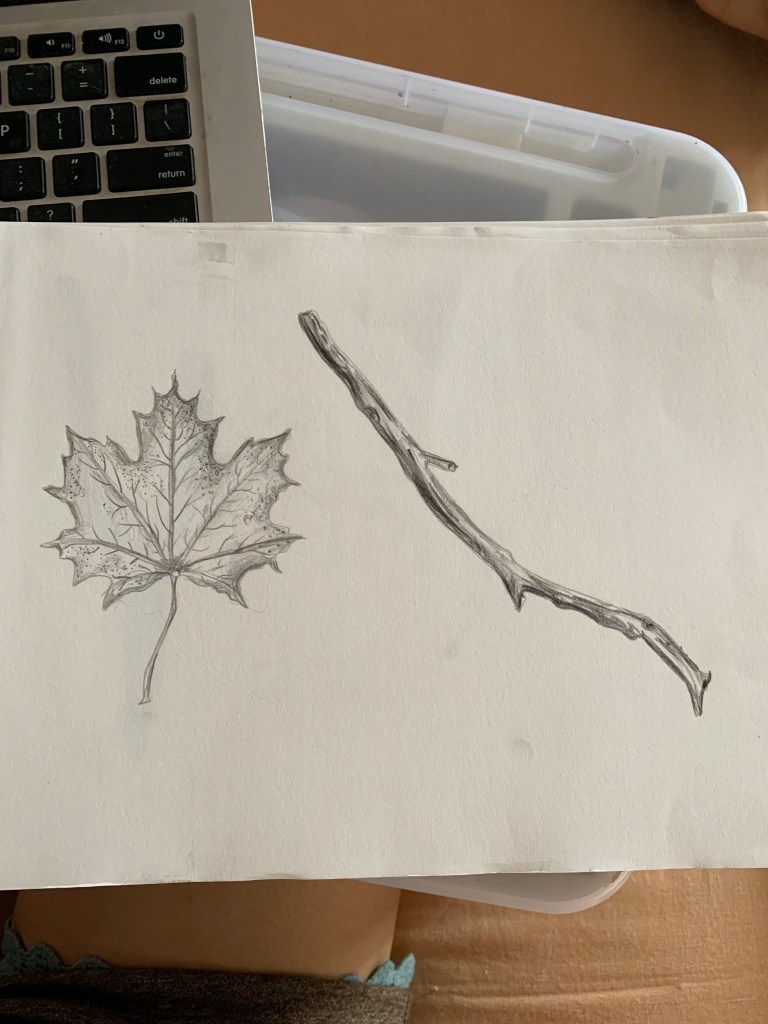
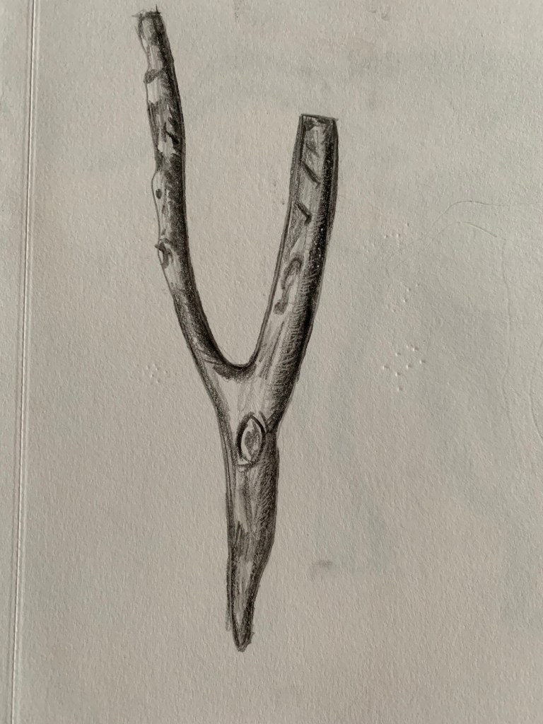
Week 5 | August 30th, 2019 | Jai Ranjit
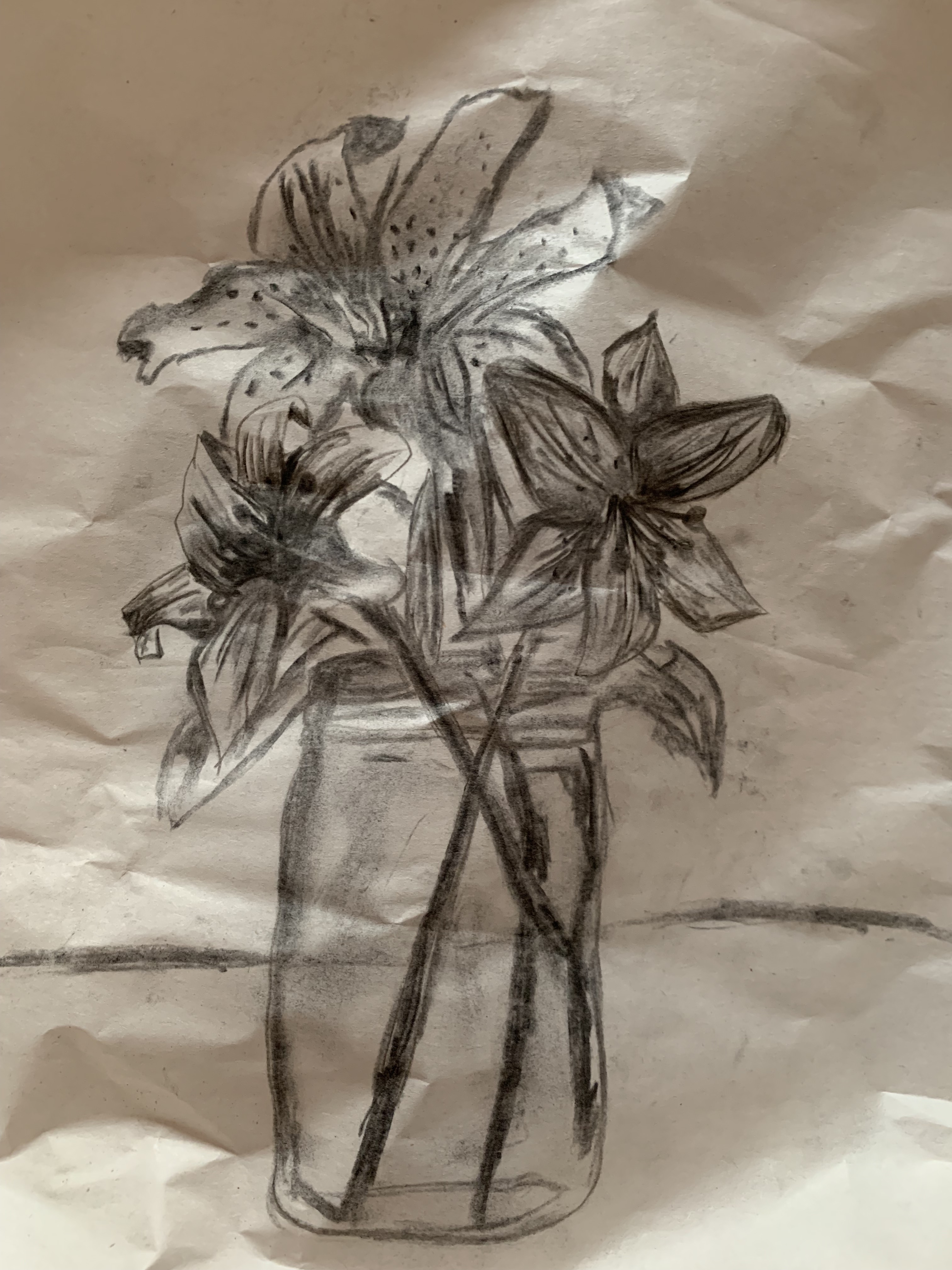
In Today’s class, we learned how to render drawings with graphite pencils. We were told to bring leaves, flowers, and stems to class, all in different states and draw them. These are the drawings I completed in class and at home.

I kept erasing and redrawing in order to experiment with different graphite shades, and ended up creating more shadows despite the abundance of light. I tried to better my skills at creating the illusion of light by using an eraser as a tool.


When I showed Jai sir my rose composition, I learned that I was rendering the shadows incorrectly. I also learned that roses have clear, delicate and smooth petals, I on the other hand made them sharp and a little too dark. Although, I learned how to use the eraser to my benefit and show the highlights in the roses.

Week 6 | September 6th, 2019 | Jai Ranjit
In week six of drawing, we learned one, two, and three point perspectives as well as the fish eye perspective. Perspective has always been one of the topics that I have tended not to be very comfortable with. I struggle with the accuracy aspect of it as well as dimensional aspects when depicting 3D artwork. These are the perspective drawings I worked on in class today:

Three point perspective drawing of a bottle, glue stick, and highlighter 
two point perspective drawing of my wallet 
two point perspective of a book, a phone and a pair of glasses 
Two point perspective drawing of a book 
Three point perspective drawing of a book 
one point perspective drawing of a book
As I got reacquainted with perspective drawing, I realised that I should cut it down to learning the basics first. Such as how the horizon line can help me gauge a better understanding of the eye level, and where my drawing begins and ends. Furthermore, I learned about vanishing points and how even though in real life parallel lines don’t meet, it seems like they can in drawings.
Fish eye perspective
As we were taught of the fish eye perspective, the first thing I thought of was a GoPro Camera. It’s designed to capture an almost spherical and panoramic picture. Similarly, I learned that artists use fish eye perspective drawings to portray a larger scene with a forced perspective.
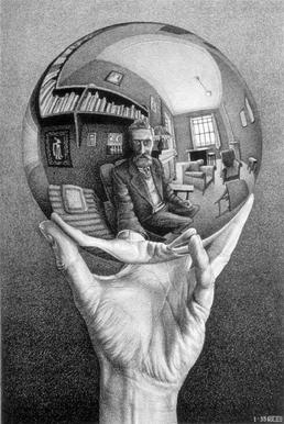
To help myself gauge a better understanding of the fish eye perspective, I searched up the self portrait (above) by M.C. Escher. In this self portrait, I understood how Escher makes himself the focal point of the drawing using the fish eye perspective and makes use of the background to add context to the final picture.
Learning from “detachment” as a designer
We ended the day on a bittersweet note. We discussed about how as a designer, it is crucial to let go of your art and part with it no matter how good or bad you think it is. By detaching yourself from your art, you can learn how to become a better designer.
So I went home, drew something I was quite proud of and decided to tear it:
Before:

After:

If I’d say that tearing apart my artwork didn’t absolutely kill me, I would be lying. But this felt more like a momentary heartache, than a monumental one. Yes, it was hard to tear apart something I worked hard on and would never have imagined tearing apart, but it honestly only hurt for five minutes. After those five minutes, it felt liberating. I learned that, as a designer, it is important to understand your worth, your limits and your capabilities. If I could draw it once, I can definitely draw it again, probably twice as better and twice as faster. So, in hindsight, I never really “lost” anything, I just bettered my learning skills as a designer.
Week 7 | September 13th, 2019 | Jai Ranjit
Foreshortening
In this week, we continued learning perspective. Although in this class, we learned how to create perspective with human figures, by using foreshortening. I learned that foreshortening is when artists render figures in order to show depth to create an illusion of distance

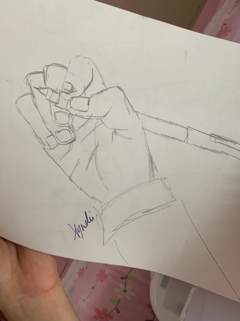
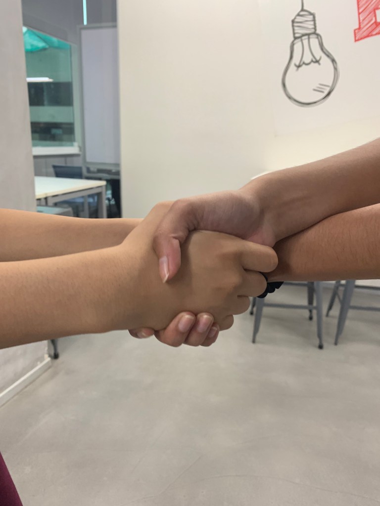
At first, the idea of drawing in perspective with human figures made me fret a lot. I had never done it before. However, I learned to break certain elements of my drawing down to the basics. I learned how to compare dimensions (like of the the size of the face when compared to the fist) and use the perspective guidelines to guide my dimensions and lines. I also learned how to start with basic shapes and then carry on to adding more elements to make my drawing look like a human figure.
Another lesson I learned today, is how gradation can also help in showing depth, space and distance, especially when drawing in perspective.
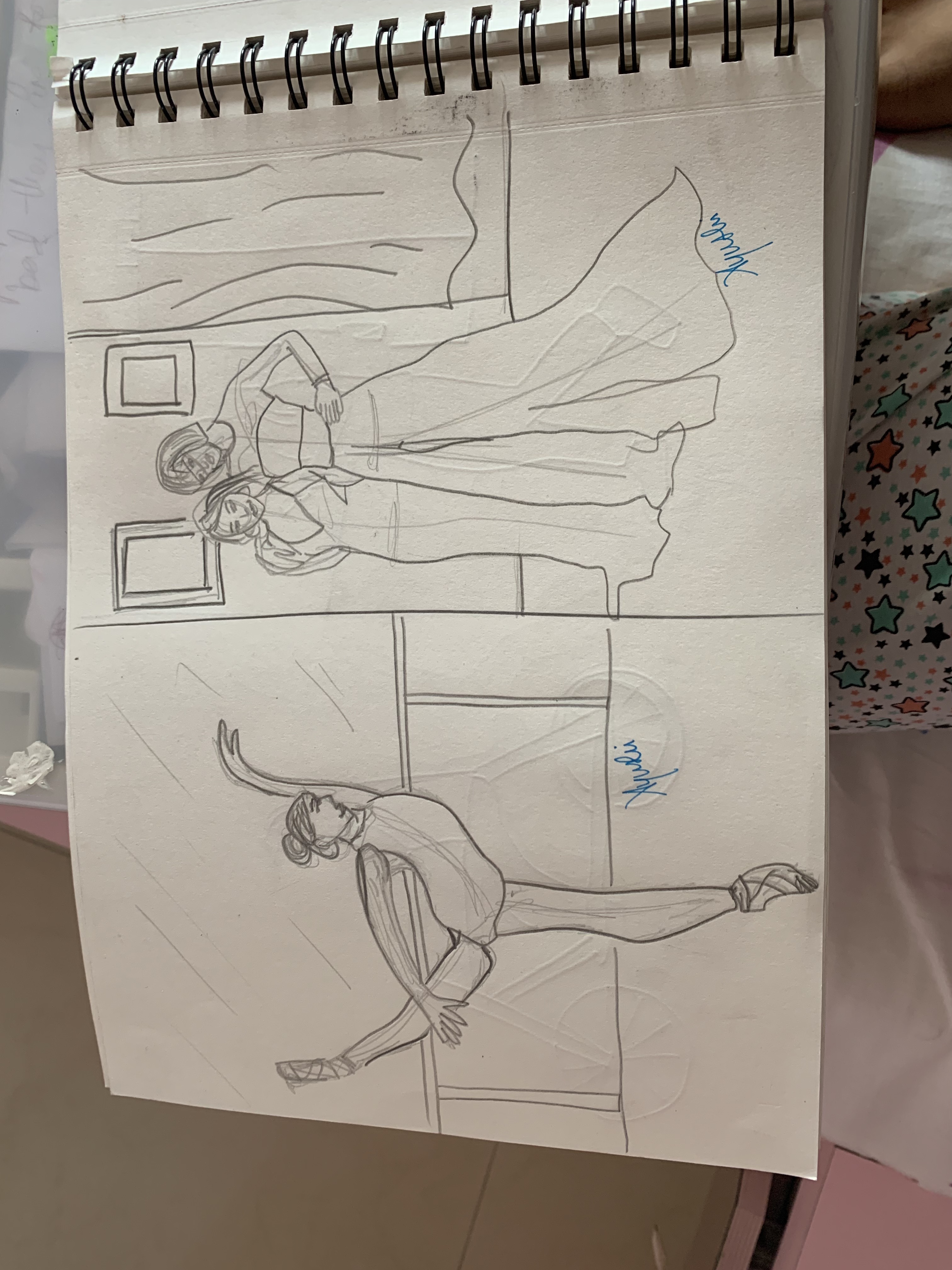
These are the illustrations I completed at home. As I practiced more, I gradually got more accustomed to using the perspective guidelines and create the human figures.

A self portrait of me holding an apple 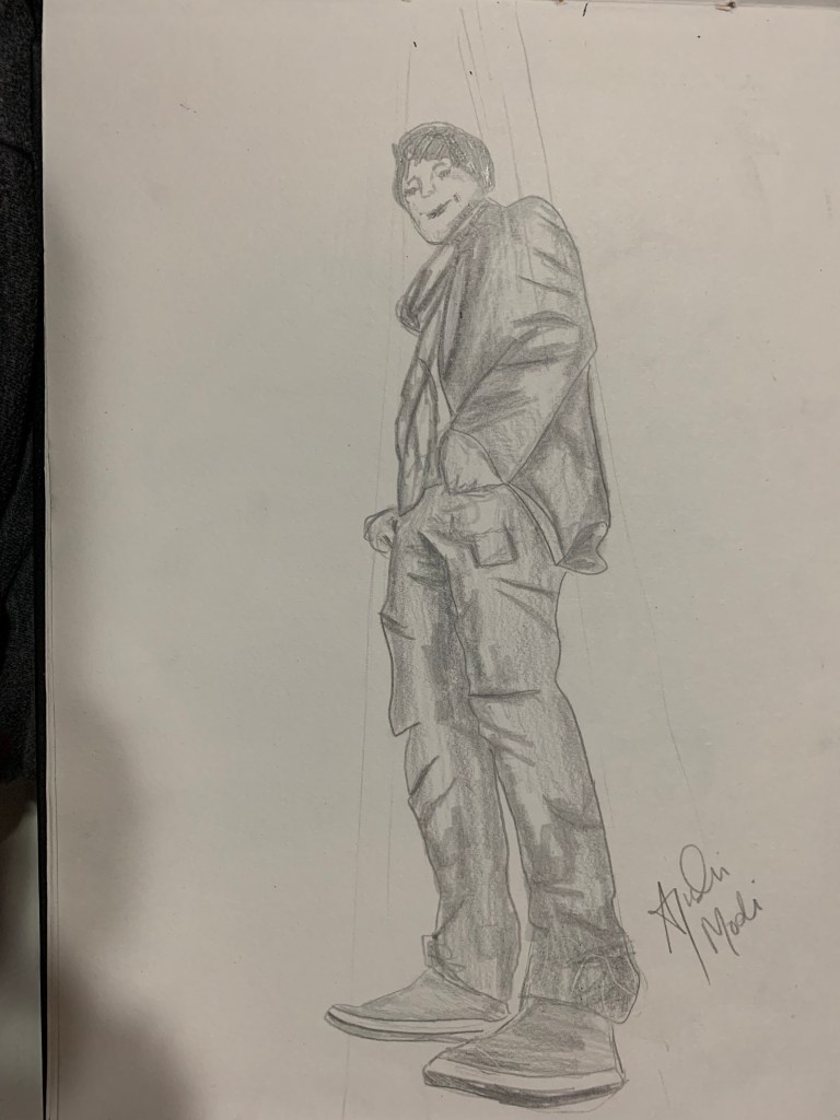
Ant’s eye perspective of a man 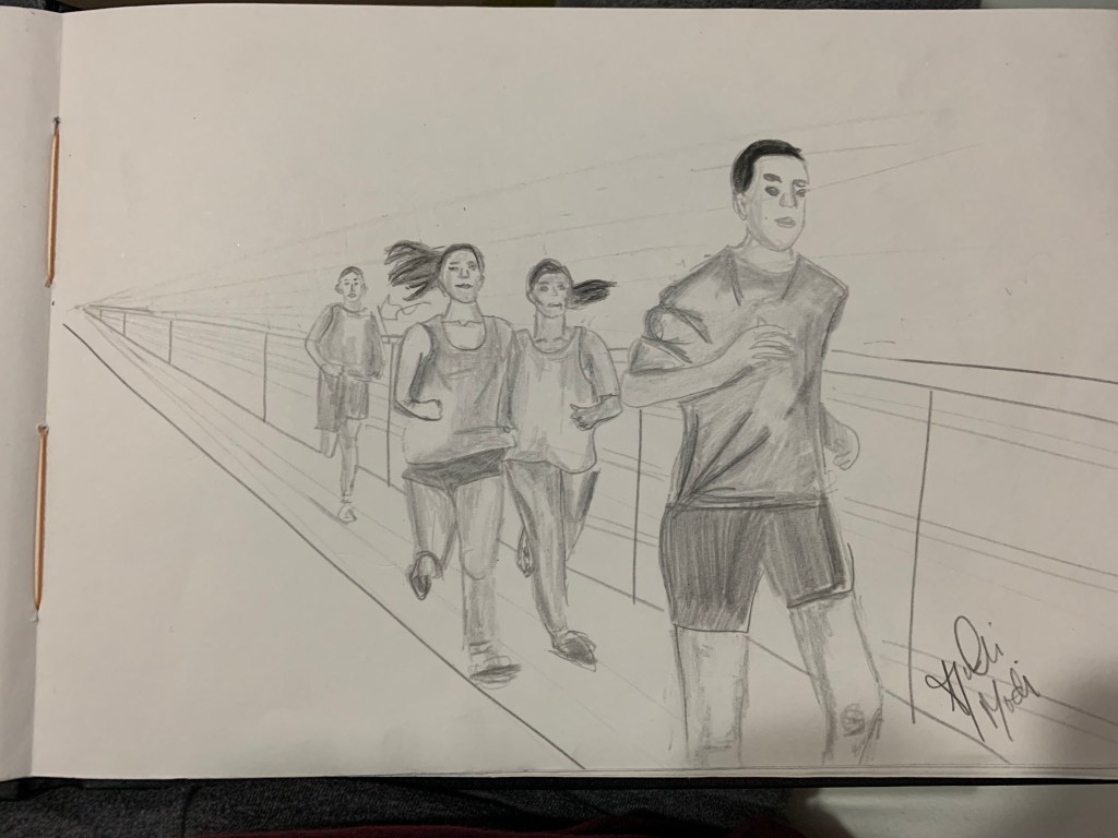
A group of people running in a single file 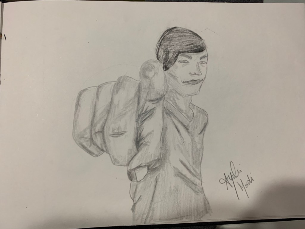
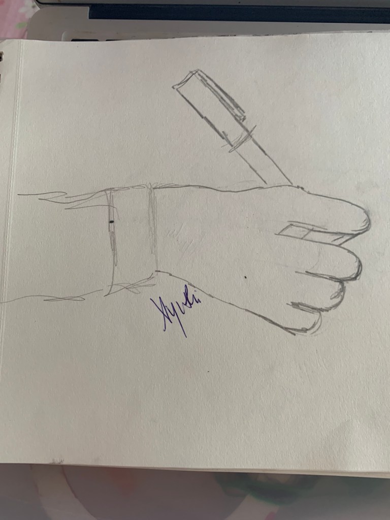
my friend pointing a finger at the camera 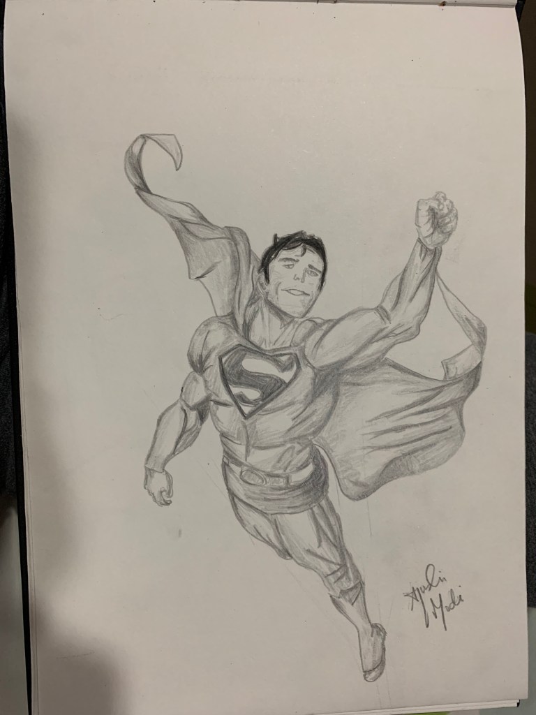
Superman (an internet picture) in perspective 
My little cousin on a swing

Week 8 | September 20th, 2019 | Jai Ranjit
This week, we learned about our next project: Creating a zine. I had known what a zine was when we were introduced to this topic, but I had never actually made one. So the prospect of making one excited me.
During our peer review, I learned and noticed how despite my classmates and I having made a few mistakes and not being that satisfied with our artwork in some cases, it still helped with our progress as artists and designers. I learned that trial and error is a necessary and crucial part in success and learning, especially when you’re a designer. As aggravating as it can be to initially not be so great at what you love to do in the beginning, with enough hard work, you will reap the benefits of your results. I also learned that I should be more confident when making my artwork and not compare mine to everybody else’s because it might hinder my own personal progress. This peer review was much needed because it really taught me how to cut myself some slack and give myself some time and room to improve.
Furthermore, I learned how to experiment with colour in this class, as that is what we’re going to be exploring for the next couple of weeks.
Week 9 | 25th September, 2019 | Jai Ranjit
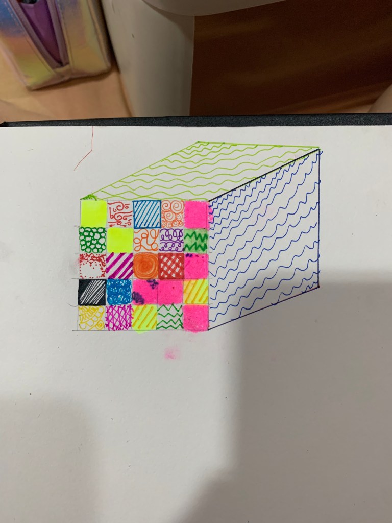
In this class, I learned how to map colours on a grid. This exercise helped me understand how to break down certain elements of a painting. In this case, the crucial key element is colour. At first, it was frustrating and nerve-racking to depict the picture using nothing but linear lines and a grid. However, as I kept continuing the exercise, I learned the objective of it: to practice color swatching and noticing aspects and colour related parts of a painting. I learned how to simplify a painting more and not focus on the details, but the bigger aspects that give it detail. This activity made me more observant and made it easier for me to spot significant tints and tones of a picture and distinguish the colours.
Below I made an attempt to depict a picture I took of a temple in Japan:

A pixelated depiction of the picture in the right 
an A4 printout of the original photograph
I chose to use smaller grids (1cm x 1cm) because the photograph had a lot of colour palettes and tones, so in order to depict it in a pixelated manner, I thought to add more boxes and make an A4 depiction.